
neutral fall decor
By Anna Grace | 13 september 2026
The Neutral Fall Decor Guide That’ll Make Your Home Feel Like a Cabin, Not a Costume Party
Orange and black had a good run. But somewhere between the fifteenth inflatable skeleton and the third “pumpkin spice everything” candle, a lot of us started craving something calmer. That’s where neutral fall decor comes in think warm creams, soft browns, dried grasses, and textures that feel like a cozy sweater instead of a costume party.
I switched to a neutral fall palette three years ago after realizing my living room looked like a craft store exploded every October. My husband still teases me about the “great pumpkin purge,” but honestly? The house has never felt more put-together during the season. If you’re ready to trade the neon gourds for something a little more grown-up, here’s how to do it right.
Start With a Base Palette (And Actually Stick to It)
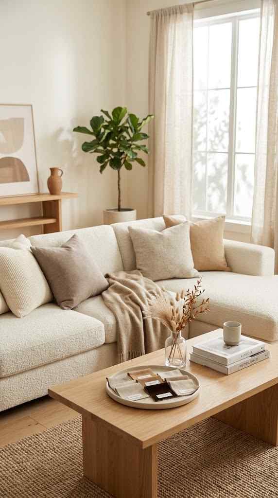
The biggest mistake people make with neutral fall decor is picking neutrals and then still adding a few “just this once” orange accents. That defeats the whole purpose. Pick a lane warm ivory, oatmeal, taupe, camel, soft rust, or deep chocolate and let everything you buy answer to that palette.
Here’s a simple way to build your base:
- Anchor color: cream or ivory for large items like throws and pillow covers
- Depth color: taupe or warm gray for contrast without harshness
- Accent color: one muted tone like terracotta or olive, used sparingly
Why does this matter so much? Because a tight palette is what makes neutral decor look intentional instead of like you forgot to decorate for fall at all. Random beige items scattered around a room just read as “no theme,” not “elegant fall theme.”
One thing worth mentioning: undertones matter more than most people realize. Cream with a pink undertone can clash horribly with a taupe that leans gray, even though both are technically “neutral.” Before buying anything, hold swatches next to each other in natural daylight, not under your kitchen’s yellow bulb. It sounds fussy, but a mismatched undertone is the number one reason a neutral room ends up looking muddy instead of cohesive.
Budget plays into this too. You don’t need to replace every pillow and throw in the house at once. Start with the biggest visual real estate think your sofa throw, your rug, or your dining table runner and build outward from there. Smaller accents like coasters or a single vase can wait until you’ve confirmed the big pieces actually work together in your space.
A lot of people also assume neutral means boring, but variation in tone does the opposite. Pair a warm camel armchair with a cooler taupe cushion, and suddenly the room has depth without a single “loud” color in sight. It’s a subtle contrast, but your eye notices it even if you can’t quite explain why the room feels finished. Consider this your permission slip to mix warm and cool neutrals within the same space, as long as the overall palette stays grounded.
Layer Textures Instead of Colors
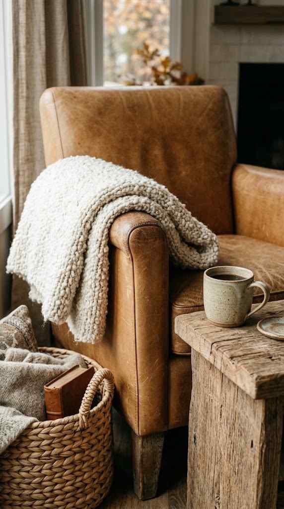
Once color is locked in, texture becomes your best friend. This is honestly the secret that most neutral rooms are missing without pattern or bright color to catch the eye, texture has to do all the heavy lifting.
Chunky knit throws, nubby linen table runners, woven baskets, and rattan accents all bring warmth without adding a single orange leaf. Mix smooth ceramics with rough wood and soft wool for a layered look that feels rich rather than flat. A room with five different beige textures actually looks more interesting than a room with five different fall colors.
I like to think of texture as the seasoning in a dish that has almost no spice it’s doing quiet, essential work. Skip it, and your neutral fall setup risks looking a little sterile or unfinished.
Texture also solves a practical problem: durability. Fall means muddy shoes, kids tracking in leaves, and pets shedding on every surface, so choosing tactile, forgiving materials isn’t just about looks. A chunky bouclé throw hides pet hair far better than a smooth velvet one, and a woven jute rug handles foot traffic without showing every scuff.
Don’t be afraid to mix scales either. A large woven basket on the floor paired with tiny textured coasters on the coffee table creates a rhythm that keeps the eye moving around the room. If everything is the same size and weight, even a beautifully textured space can start to feel monotonous.
Layering doesn’t require a big budget. A trip to a secondhand shop can turn up wool blankets, wooden bowls, or ceramic vases for a fraction of retail price, and slightly imperfect, worn-in pieces often add more character than anything brand new. My favorite find last year was a chipped stoneware pitcher from an estate sale that now holds dried branches on my kitchen counter it cost four dollars and gets more compliments than anything I bought full price. Texture rewards a little patience and a willingness to hunt rather than just click “add to cart.”
Swap Pumpkins for Dried Botanicals
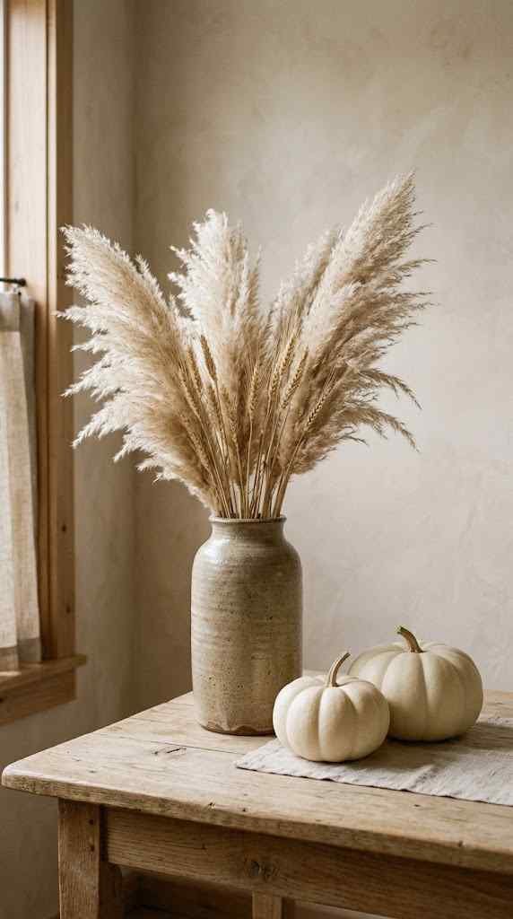
You don’t need to ban pumpkins entirely (white and cream pumpkins are still very much neutral-friendly), but dried botanicals are where neutral fall decor really shines. Wheat stalks, pampas grass, dried eucalyptus, and preserved leaves bring that autumnal feeling without shouting about it.
A few easy wins:
- Fill a tall ceramic vase with pampas grass for an instant statement piece
- Tuck small bundles of dried wheat into a bowl on the coffee table
- Hang a dried floral wreath in muted tones on the front door
- Scatter preserved leaves across a mantel or table runner
FYI, dried arrangements also last way longer than fresh flowers, so you’re not restocking every two weeks. That’s a small win for your wallet and your Saturday mornings.
If you want your arrangements to last the whole season, a little care goes a long way. Keep dried botanicals out of direct sunlight, since UV rays fade even the sturdiest preserved leaves within a few weeks. A gentle shake outside every so often also keeps dust from building up and dulling their color.
Height and placement matter more than people expect. A tall pampas grass arrangement works beautifully in a corner or beside a fireplace, but the same bunch crammed onto a small side table can overwhelm the whole surface. Give your botanicals room to breathe, and resist the urge to fill every empty spot in a room negative space is part of what makes neutral decor feel calm instead of cluttered.
For anyone nervous about DIY arranging, start small. A single stem of dried eucalyptus in a bud vase on a nightstand is an easy, low-commitment way to test the look before committing to a large statement piece. You can always build up from there once you get a feel for proportions. And if pampas grass shedding drives you as crazy as it drives me, a light coat of hairspray keeps the fluffy seed heads from scattering all over your floors.
Rethink Your Lighting and Candles
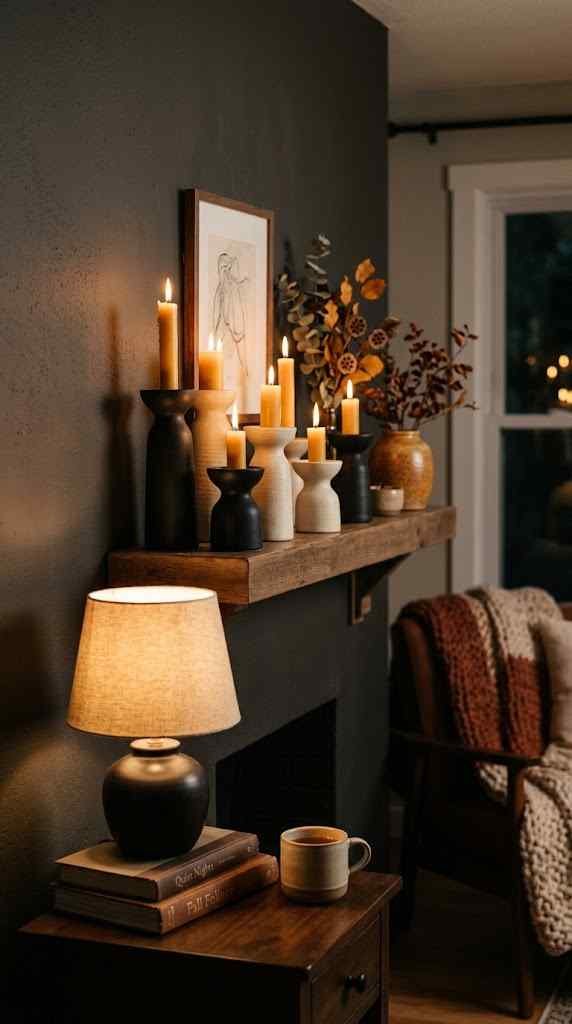
Lighting changes everything about how a neutral space feels. Cool white bulbs will make even the coziest cream sofa look a little clinical, so switch to warm-toned bulbs for the season if you haven’t already.
Candles matter too, but skip the neon-orange pumpkin ones sitting in the seasonal aisle. Go for candles in cream, taupe, or matte black vessels instead the scent can still say “fall” (cedar, fig, sandalwood, warm vanilla) even if the packaging doesn’t scream it. Layer a few pillar candles of varying heights on a wooden tray for an easy centerpiece that takes two minutes to assemble.
Is this a small detail? Sure. But small details are basically the whole game in neutral decor, since there’s no bold color to distract from a mismatched lamp or a bulb that’s too blue.
Layering your light sources makes a bigger difference than most people expect. Instead of relying on one overhead fixture, mix in table lamps, a floor lamp, and candlelight so the room has multiple soft glows rather than one harsh source. This is especially true in the evening, when warm layered light does more to create a “fall feeling” than any decoration could.
Dimmer switches are a small investment that pays off constantly. Being able to lower the lights during a cozy dinner or a movie night instantly shifts the mood, and it costs far less than most decorative upgrades. If rewiring isn’t an option, plug-in lamp dimmers work almost as well and require zero electrical know-how.
Scent matters just as much as color when you’re going for a neutral fall look, since it’s often the first thing guests notice walking through the door. Rotate a few signature scents through the season instead of burning the same candle for three straight months your nose adjusts to a smell faster than you’d think, and switching things up keeps the atmosphere feeling fresh. Amber jars or simple glass votives keep the vessels themselves in line with your palette, so even candle shopping becomes part of the design plan rather than an afterthought.
Don’t Forget the Front Porch
Neutral fall decor doesn’t have to stop at your front door. Your porch is basically the preview trailer for your whole aesthetic, so it should match the tone you’ve set inside.
Swap the plastic orange mums for stone-colored planters filled with ornamental grasses, white pumpkins, or dried corn stalks in a soft palette. A jute doormat and a simple wooden sign do more visual work than five inflatable characters ever could. Less clutter outside almost always reads as more expensive and more intentional.
If you’re renting or don’t want anything permanent, a neutral wreath and a couple of textured throw pillows on an outdoor bench can transform a porch in about twenty minutes.
Seasonal maintenance is worth planning for too. Natural elements like dried corn stalks or grasses can get soggy and lose their shape after a few heavy rains, so it helps to pick a sheltered spot under an eave or overhang if your porch sees a lot of weather. A quick Sunday check-in to swap out anything looking worse for wear keeps the whole setup looking fresh through November.
Lighting extends the neutral theme outdoors just as much as indoors. String lights in warm white, rather than multicolor, keep the porch glowing without breaking from your palette, and a couple of lanterns with flameless candles add ambiance without any fire risk on a windy night. Even a simple pair of matching planters flanking the front steps can make a porch feel styled rather than thrown together.
Scale is everything outside, too. A porch that’s small can get overwhelmed fast if you try to fit too many elements onto it, so pick two or three focal points a wreath, a planter arrangement, and a doormat and let those carry the whole look. Restraint tends to look far more expensive than abundance, especially when neutral tones are already doing the heavy lifting.
FAQ’s
What colors count as neutral fall decor?
Cream, taupe, oatmeal, camel, soft rust, and chocolate brown are the core colors used most often.
Can I still use pumpkins in a neutral fall theme?
Yes, white or cream pumpkins fit perfectly and add shape without breaking the palette.
How do I make a neutral room not look boring?
Layer different textures like knit, linen, wood, and rattan instead of relying on color contrast.
What are good neutral alternatives to fresh fall flowers?
Dried pampas grass, wheat stalks, and preserved eucalyptus last longer and match the palette better.
Does neutral fall decor work for small spaces or apartments?
Absolutely, since neutral tones and minimal clutter naturally make small rooms feel calmer and larger.
CONCLUSION
Neutral fall decor isn’t about stripping away the season’s coziness it’s about trading loud, disposable decorations for pieces that feel a little more like home and a lot more reusable. Once you build a solid palette, lean on texture, and swap a few bright accents for dried botanicals and warm lighting, the whole space just clicks into place. IMO, once you go neutral for fall, it’s genuinely hard to go back to the orange-and-black routine it just feels more like your house instead of a seasonal costume for it.