
Modern Fall Decor
By Anna Grace | 3 july 2026
Modern Fall Decor: Skip the Orange Pumpkins, Embrace What Actually Works
Your grandmother’s orange and brown autumn aesthetic? Yeah, it’s officially retired. Modern fall decor has completely shed its dated peacochy skin and embraced something cleaner, bolder, and honestly way more interesting. We’re talking rich jewel tones, unexpected textures, and a vibe that feels less “forced seasonal obligation” and more “this is how I naturally live right now.”
The thing that shocked me this year was how many people admitted they’d been defaulting to store-bought fall decorations out of guilt like they were checking a seasonal box rather than actually wanting their spaces to feel like autumn. That needs to stop. Modern fall decorating isn’t complicated; it’s just different from what you’ve probably been told to do.
What’s wild is how much the internet still perpetuates the old playbook. Scroll through home décor accounts and you’ll see the same tired “cozy autumn” tropes recycled endlessly pumpkins, hay bales, plaid, orange everything. But actual designers and people with real taste in their homes? They’ve moved on. They’re creating spaces that honor the season without sacrificing their year-round aesthetic or pretending that rust-colored everything suddenly feels good just because the calendar flipped.
The homes that actually photograph well, the ones you see in design publications, share something in common they treat fall decor as an evolution of their existing style, not a total personality transplant. That’s the shift. That’s what modern fall actually means.
The Color Shift: Why Burnt Orange Is Over (And What’s Taking Its Place)
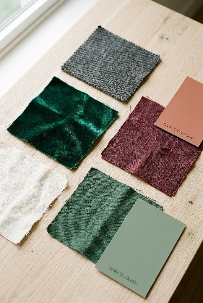
Walk into any home décor store and you’ll still see the traditional fall palette front and center. Burnt orange, rust, mustard yellow, deep chocolate brown the classics get shelf space because they move inventory. But the homes that actually look intentional right now are playing with a completely different spectrum.
Deep emerald greens, charcoal blacks, terracotta reds (not orange), and sophisticated burgundy are the colors steering modern fall design. If you want something lighter, warm grays and ivory work beautifully too. The shift feels less like “fall is here, activate orange mode” and more like “I’m adding depth to what I already love.”
I redid my living room last October with a forest green velvet chair and cream linen curtains instead of pulling out the orange décor boxes, and I legitimately kept the setup through winter. No switching back. That’s the test for modern decor does it feel good year-round, or just in October?
The psychology here matters: muted, complex colors make spaces feel curated rather than costumed. Your brain registers them as intentional design choices, not seasonal overlays. When you walk into a room with jewel tones, your subconscious reads it as “someone thought about this.” Orange pumpkins everywhere read as “it’s October, obligation time.”
Color psychology also plays into this. Burgundy and deep green create feelings of sophistication and calm, while burnt orange can feel chaotic if you’re not careful with how it’s deployed. Modern fall decor uses color to set a mood, not just mark a calendar moment. Think about how a room feels when it’s wrapped in emerald tones with gold accents versus how it feels drowning in orange. Completely different emotional response.
Here’s the practical side: if you’re investing in throw pillows, area rugs, or wall art, you want colors that work beyond September through November. A charcoal gray accent wall with jewel-tone accessories? That stays relevant. An entire room in burnt orange? Good luck making that feel fresh in January.
The modern approach also considers undertones more carefully. Warm terracotta has completely different energy than orange-orange. Burgundy lands differently than rust. These nuances matter because they determine whether your space feels timeless or dated in six months.
Textures Over Trinkets, Building Depth Without Clutter
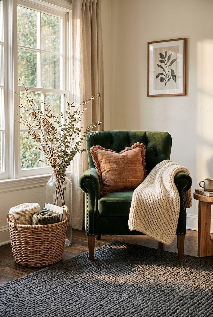
Modern fall decorating isn’t about quantity. You don’t need sixteen decorative gourds or a pumpkin in every corner. Instead, layer textures that create visual interest without visual noise.
Think woven throws, linen pillows, chunky knit blankets, natural wood elements, and unexpected fabrics like velvet or leather. A single large woven basket becomes a focal point. A thick wool rug changes the entire room’s temperature (literally and emotionally). Real branches in a tall vase beats plastic leaf garland every single time.
Here’s the winning formula: one major texture statement per room, then layer 2–3 complementary textures around it. A leather ottoman with a chunky knit throw and a linen pillow in a jewel tone does more work than an entire shelf of figurines. IMO, this is where modern fall separates from “basic fall” it trusts negative space.
Texture is doing the heavy lifting that color used to do. When you remove the color spectacle, what remains is the tactile experience. That’s actually more satisfying. Running your hand across a wool throw or sinking into a velvet chair creates a memory. Looking at a plastic pumpkin doesn’t.
The texture layering strategy works because it builds depth visually and physically. Your eye moves through the space noticing different materials, different weaves, different finishes. This keeps a room from feeling boring even when the color palette is intentionally restrained.
Real wood brings warmth that stained wood doesn’t. Natural fibers (linen, wool, jute) communicate quality and intention. Unexpected touches like leather or velvet signal that you’ve thought about this beyond “it’s fall season.” These choices whisper sophistication instead of shouting it.
Another texture win: mixing matte and glossy finishes. A glossy ceramic vase next to a matte linen pillow creates visual interest without clutter. A smooth leather chair paired with a chunky knit throw does the same. Your eye needs variation to stay engaged, and texture provides that without requiring you to buy more stuff.
The sustainability angle here matters too. If you’re building with textures instead of trinkets, you’re likely choosing quality pieces you’ll actually keep. A gorgeous linen throw from a good brand lasts decades. A plastic leaf decoration lasts one season in the landfill.
The Sustainable Angle: Fall Decor That Doesn’t End Up in a Landfill
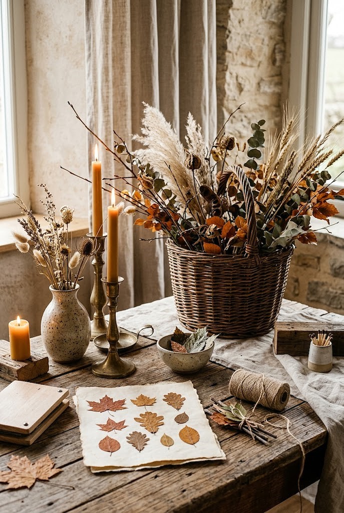
You know what’s more on-brand for 2026 than ever? Actually caring that you’re not drowning the planet in disposable autumn decor.
Modern fall decorating leans heavily into:
◾ Natural elements you already have: branches from your yard, leaves, stones, dried grasses
◾ Heirloom pieces: vintage autumn decor that actually has history and charm
◾ Repurposing what you own: changing throw pillow covers instead of buying new pillows, swapping accessories rather than replacing entire furniture pieces
◾ Quality over quantity: investing in one beautiful garland that lasts five years instead of five cheap ones you ditch after one season
Real talk I spent $40 on a linen table runner in a burnt sienna tone two years ago, and I’ve used it every single fall since. I’ve seen people drop $80 on Halloween décor they use for three weeks. Which one feels smarter?
Sustainable doesn’t mean boring. It means intentional. It means your fall décor actually reflects your values, not just what Target had in stock.
The sustainable approach also means getting creative with what you have. Do you have books with fall-colored spines? Arrange them visibly. Own any vintage ceramics? Bring them out. Have a collection of natural items from hikes or walks? Display them. Your existing possessions become décor when you curate them intentionally.
Dried flowers and grasses are the ultimate sustainable play. A single stem of pampas grass in a tall vase costs almost nothing but creates instant impact. Eucalyptus bundles dry beautifully and cost a fraction of fresh flowers. Air-dry your own hydrangeas from summer and you’ve got free fall décor.
Shopping secondhand for fall pieces is also massively underrated. Thrift stores, vintage markets, and online resale platforms have incredible autumn items real wooden pumpkins, vintage brass candlesticks, antique mirrors that cost way less than new. Plus, you’re literally keeping things out of landfills while building a more interesting, unique space.
The longevity question should guide every purchase. Before adding something to your cart, ask: “Will I use this next year? And the year after?” If the answer is no, keep scrolling. This mental filter saves money, reduces waste, and forces you to be intentional.
Blending Minimalism With Warmth (Yes, These Actually Coexist)
This is the tension that modern fall decoration actually solves beautifully. How do you create that cozy, warm autumn feeling without cramming your space full of stuff?
You focus on feeling rather than decoration count. Soft lighting (warm-toned lamps, candles with real wood wicks) creates coziness. A single statement artwork in fall tones on your wall hits different than six small pieces. One large mirror reflecting candlelight works better than a collection of small décor items. Minimalism doesn’t mean cold or sparse it means every piece earns its place.
Your fall space should feel like you can actually sit in it, not like you’re navigating an obstacle course of seasonal items.
The smart move: decide what makes autumn feel right to you specifically. Is it candlelight? Specific scents? Certain colors? Once you know that, eliminate everything that doesn’t serve those goals. What remains becomes genuinely impactful.
The minimalist-meets-cozy approach actually creates more visual calm. Your brain doesn’t have to process clutter, so it can actually relax into the space. This is why high-end hotels and design showrooms feel so soothing they’ve removed everything unnecessary, so what remains commands attention and creates atmosphere.
This strategy also makes your space feel bigger. Minimalist spaces with intentional warmth feel more luxurious because they give your eye room to move. It’s the difference between a crowded thrift store and a carefully curated boutique. Both have stuff, but the boutique approach respects your attention.
Warmth through minimalism means choosing quality over quantity, but also choosing the right qualities. A wool rug creates warmth through texture. Candlelight creates warmth through ambiance. A single piece of autumn-colored artwork creates warmth through intentionality. None of these require clutter.
The lighting piece here is crucial. In minimal spaces, lighting becomes your primary tool for creating atmosphere. A dark, minimal room feels cold and unwelcoming. The same minimal room with proper warm lighting feels intimate and intentional. This is why so many minimalist spaces fail they forget that warmth is essential to livability.
DIY and Personalization: The Stuff That Actually Matters
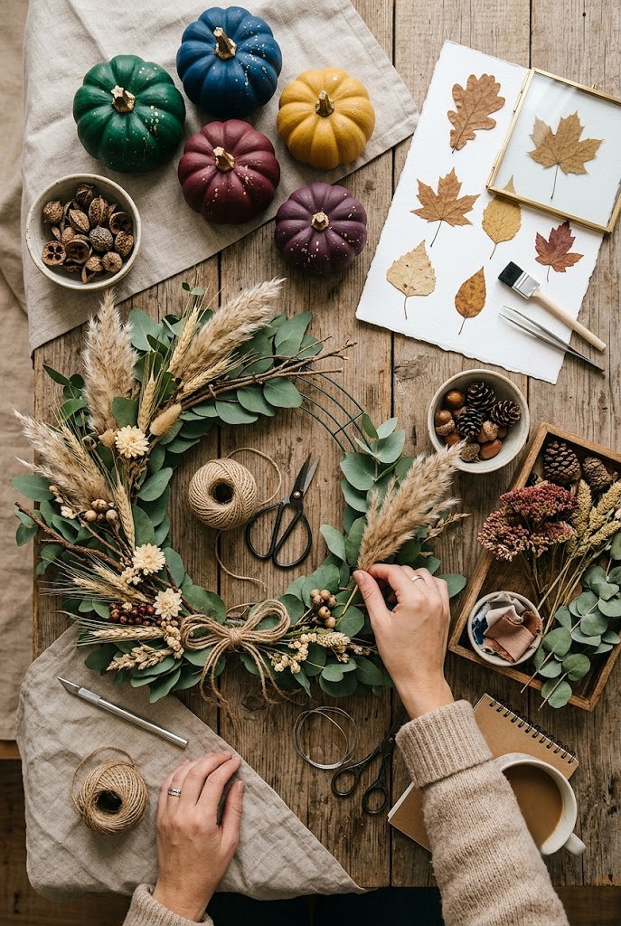
Here’s what modern fall decor gatekeeps from basic fall: personalization. The things you make (or at least heavily customize) always look better than factory-produced decorations.
Simple projects that move the needle:
◾ Paint pumpkins in your color palette instead of using them orange
◾ Create a gallery wall with fall-themed prints you actually like
◾ Make a seasonal wreath from fresh florals or branches
◾ Arrange a tablescape with things you already own, just repositioned
◾ Frame pressed fall leaves or botanical prints
None of this requires real skill. It requires intention.
I made a wreath last year from eucalyptus, dried pampas grass, and branches literally things from my yard and a $6 wire frame from a craft store. People asked where I bought it. That’s the vibe we’re going for.
DIY wins because it forces you to think about what you actually like, not what you think you’re supposed to like. Your version of modern fall decor should feel personal, not Pinterest-perfect.
The DIY factor also creates conversation pieces. A wreath you made tells a story. Store-bought décor sits there looking fine. There’s a difference between fine and memorable.
Personalization extends to how you display things too. Instead of buying a “fall décor collection,” pull items from different parts of your home and arrange them intentionally. That vintage book with a pretty fall-colored spine? Move it to your nightstand. Those brass candlesticks from your bedroom? Put them on the dining table. Suddenly your space feels cohesive and personal without being cluttered.
The painting-pumpkins trick deserves its own spotlight because it’s a game-changer. Metallic paint, deep jewel tones, geometric patterns, marble effects when you paint pumpkins yourself, you control the aesthetic completely. This single act transforms them from “autumn obligation” to “intentional design choice.”
Pressed leaves in frames is another high-impact, zero-skill project. Grab leaves from your yard, press them in a book for a week, frame them, done. Suddenly you’ve created unique artwork that costs almost nothing and looks sophisticated.
Lighting: The Secret Weapon Nobody Talks About
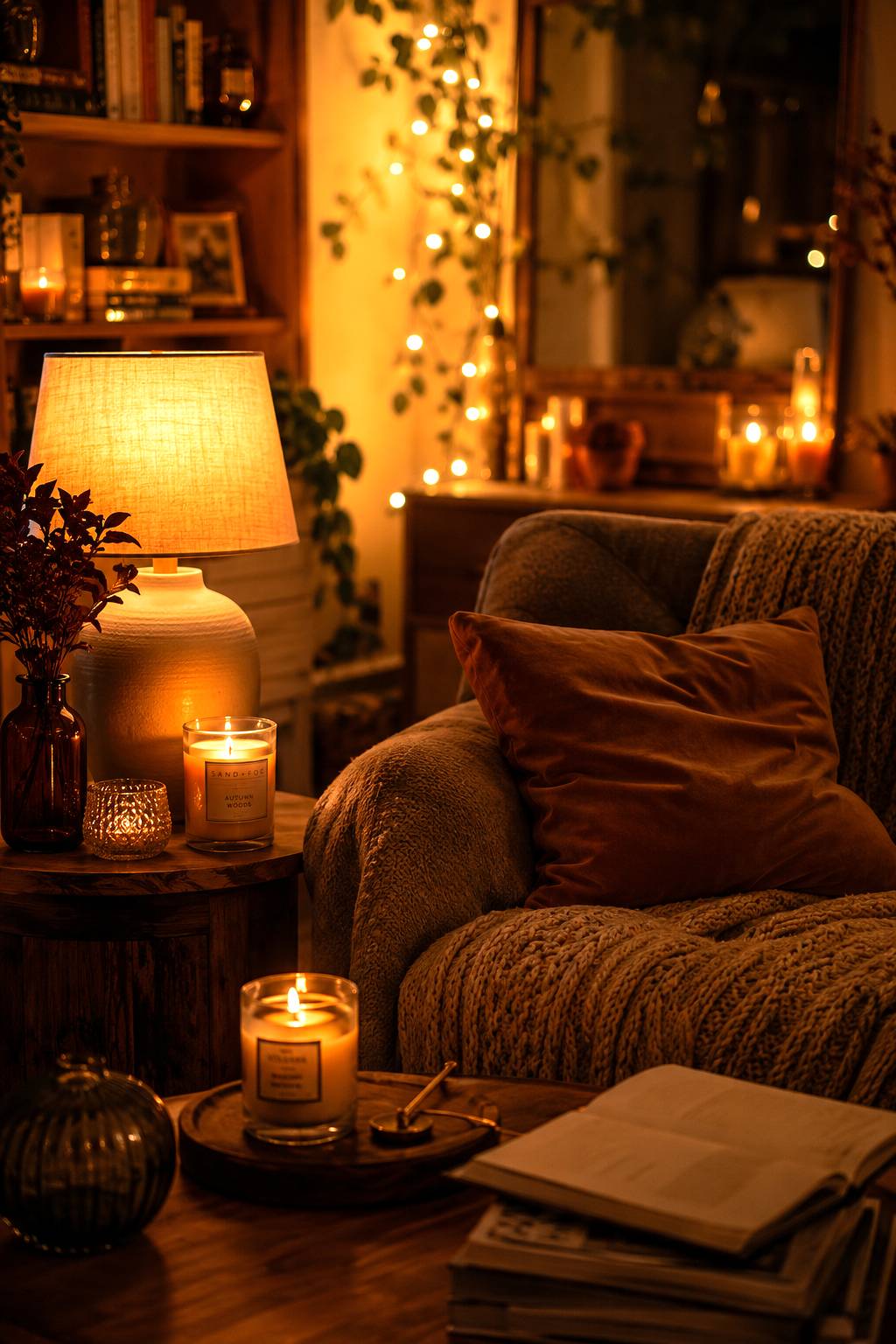
If there’s one element that separates “trying too hard” from “actually nailed it,” it’s lighting.
Modern fall décor uses warm, layered lighting to create atmosphere without relying on visual décor to do all the heavy lifting. Amber-toned bulbs, accent lamps in corners, string lights (classier than you remember), and quality candles transform a space more than any decoration could alone.
The technical bit: 2700K color temperature bulbs give you that golden, cozy autumn ambiance without the orange overtones that feel dated. This is a simple swap literally just changing your lightbulbs but it completely reframes how your space reads.
Layered lighting means multiple light sources at different heights and intensities. Instead of relying on overhead ceiling lights, use table lamps, floor lamps, and ambient light sources. This creates depth and makes the space feel intentional. When someone walks into a room with layered lighting, they immediately feel the difference, even if they can’t articulate why.
Candles are non-negotiable for modern fall. But here’s the thing quality matters. Wood-wick candles feel more luxurious and create better ambiance than standard wicks. Soy candles smell better and last longer than paraffin. Choosing good candles is actually an investment in how your space feels.
String lights have evolved beyond tacky. Warm white Edison-style bulbs on a thin wire look sophisticated, not juvenile. They’re excellent for creating ambient light in corners or along shelves without requiring new fixtures. The key is choosing warm-toned bulbs and installing them thoughtfully (not haphazardly).
The ambient light question is also about color temperature consistency. If your overhead lights are cool white and your lamps are warm, your space reads as confused. Match your color temperatures across all light sources and suddenly everything feels cohesive.
Lighting also affects how colors read. That gorgeous jewel-tone pillow looks completely different under cool white light versus warm amber light. This is why designers obsess about lighting it literally changes everything else in the room.
FAQ’s
Do I have to use orange and brown for modern fall decorating?
No. Modern fall decor embraces jewel tones, deep greens, and burgundy instead of traditional orange palettes for a fresher look.
How much should I spend on fall decorations each year?
Invest in quality, reusable pieces you’ll use long-term rather than cheap seasonal items you discard after one season.
Can I keep my fall decor up year-round?
Yes! modern fall decor works year-round if you choose timeless colors and quality pieces over stereotypical autumn items.
Is DIY fall decor really better than store-bought?
DIY often looks more personalized and intentional. Store-bought works too just select pieces that genuinely reflect your actual style.
What’s the easiest way to update my space for fall?
Swap throw pillows, layer warm lighting, and add one statement piece instead of covering everything with seasonal decorations.
CONCLUSION
The through-line connecting all of this? Modern fall decor respects both aesthetics and practicality. It doesn’t ask you to pretend you love pumpkins if you don’t. It doesn’t force orange into a space just because the calendar says October. It doesn’t demand you live in a seasonal display instead of actually living in your home.
Your fall décor should make you feel something genuine whether that’s cozy, creative, grounded, or just… ready for the cooler months. The spaces that pull this off aren’t the ones with the most stuff. They’re the ones with the most intention behind every choice.
The modern approach also acknowledges that we’re not the same people we were ten years ago. Our aesthetic sensibilities have evolved. Our values around sustainability and intentionality matter more. Our spaces need to reflect who we actually are, not who we think we should be in autumn.
This is why modern fall works so much better than traditional fall. It’s more honest. It’s more sustainable. It’s more personal. And honestly, it just looks better.
Start small. Pick one room. Choose your actual color palette (not the one you think you should use). Layer in textures that make you want to curl up. Skip anything that doesn’t serve that vision. Invest in quality lighting. Add one or two personal touches that reflect your actual taste. That’s modern fall decorating, and honestly, it’s the only way that makes sense anymore.