
Pink kitchen
By Anna Grace | 19 May 2026
Why Everyone’s Obsessed With Pink Kitchens (And How to Get the Look Right)
Pink kitchens are no longer the punchline of design they’re the power move. If you’ve scrolled through design blogs or Instagram lately, you’ve probably noticed soft blush tones, hot magenta accents, and peachy-pink cabinetry taking over spaces that used to play it safe with white, gray, and stainless steel. The shift is real, and it’s forcing everyone to reconsider what a functional, beautiful kitchen actually looks like.
Here’s the thing kitchens used to be treated like appliance rooms where aesthetics came dead last. Then people got tired of boring. Now we’re decorating them like they matter. 🙂
Why Pink Kitchens Hit Different Right Now
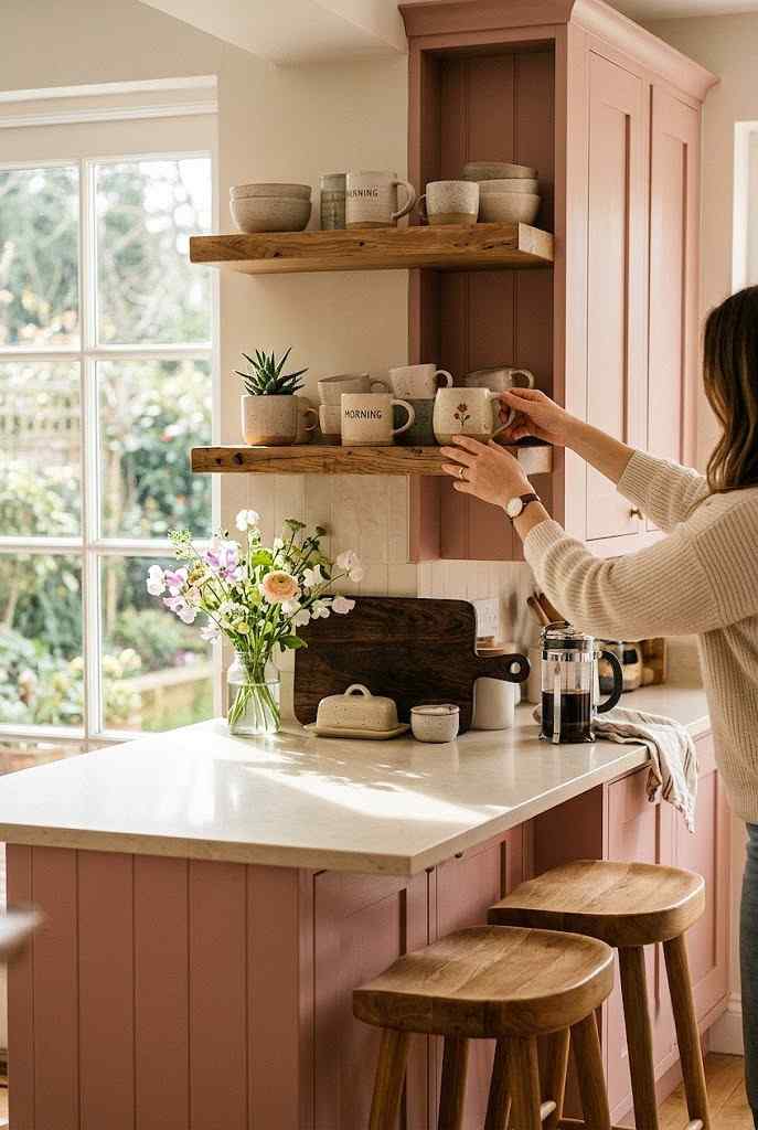
The kitchen is where life happens coffee, arguments, midnight snacks, homework, late-night conversations with your partner. Why should it look sterile? Pink kitchens work because they reject the outdated idea that a cooking space needs to disappear into the background.
The trend isn’t about going full Barbie mansion, either. Modern pink kitchens use depth and restraint. Think muted mauve, dusty rose, coral accents, or even a bold blush paired with warm wood tones. These palettes feel intentional, not accidental. They make a room feel warm and inviting instead of clinical.
What really drives this shift is psychology. Pink creates comfort. Research consistently shows that softer, warmer tones reduce stress and encourage lingering. When your kitchen looks good, you actually want to spend time there and isn’t that the opposite of every kitchen’s job description up until five years ago?
There’s also a generational shift happening. Younger homeowners grew up watching HGTV shows preach neutral, resale-friendly palettes, and honestly? They’re bored of it. A whole generation is now choosing personality over playing it safe, and kitchens are the first room to show that rebellion.
My cousin renovated her kitchen last year and went with a soft terracotta-pink on her lower cabinets. Everyone told her she’d regret it. She hasn’t stopped getting compliments since and her Zillow estimate actually went up after the reno. Sometimes the “risky” choice isn’t risky at all; it’s just different from what everyone else is doing.
Pink also photographs beautifully, which matters more than people admit. If you’re someone who shares your space online or just wants a kitchen that feels camera-ready for gatherings, pink tones catch light in a way that beige simply can’t compete with.
Color Combinations That Actually Work
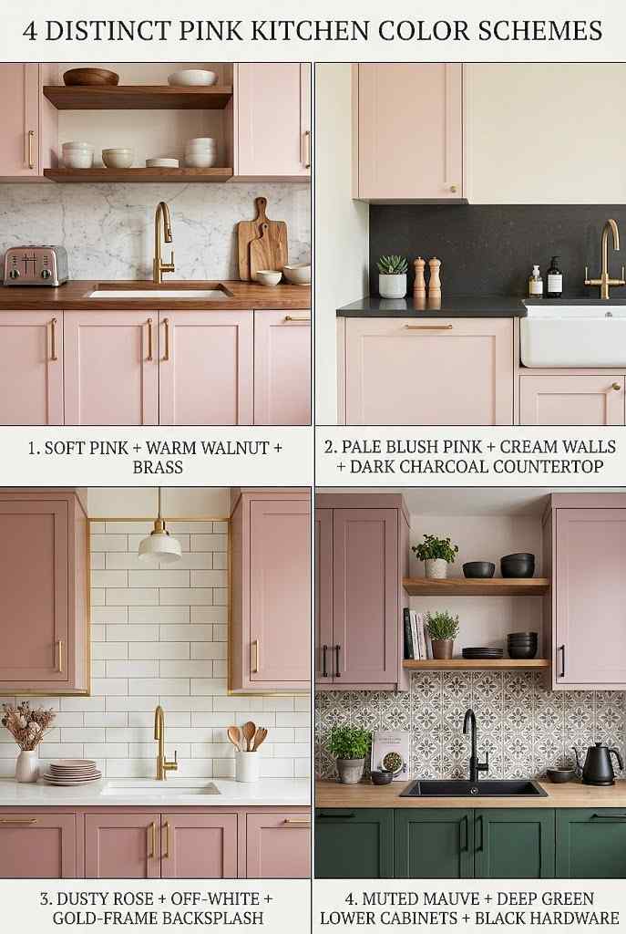
Pairing pink with the right complementary colors is what separates a stunning kitchen from a garish one. Here’s what designers are nailing right now:
Pink + Warm Wood. This combo feels organic and grounded. Natural wooden cabinetry or open shelving in oak or walnut against a soft pink wall creates balance. The wood anchors the softness of the pink, making the space feel sophisticated rather than precious.
Pink + Cream or Off-White. If you want pink to stay subtle, keeping walls or trim neutral lets your cabinetry shine. A pale pink island or cabinet faces paired with cream walls keeps things airy and modern without overwhelming the space.
Pink + Dark Accents. Black or deep charcoal hardware, countertops, or trim add contrast and prevent the kitchen from feeling too delicate. This pairing appeals to people who want personality with an edge. IMO, this is where pink kitchens become genuinely cool.
Pink + Gold or Brass. Metallic finishes in warm tones complement pink beautifully. Brass handles, light fixtures, or a gold-frame backsplash elevate the entire look and feel high-end without trying too hard.
The worst mistakes happen when people add pink without considering what it’s sitting next to. You can’t just slap a pink paint color on white cabinetry and chrome hardware that’s how you end up looking unintentional.
Another combo worth mentioning: Pink + Sage Green. This pairing has exploded in popularity because both colors sit in the same soft, muted family. A blush pink island next to sage green lower cabinets feels like a garden brought indoors fresh, calming, and surprisingly gender-neutral despite pink’s reputation.
Don’t overlook flooring either. Light pink cabinetry against dark hardwood floors creates grounded contrast, while the same cabinetry against light oak or bleached wood keeps everything airy and Scandinavian-inspired. The floor is the one element people forget to plan around, and it changes the entire mood of the room.
If you’re testing colors before committing, paint large poster boards instead of tiny swatches. Small samples lie to you pink can look completely different once it covers an entire wall versus a 2×2 inch card.
Materials and Textures Make It Real
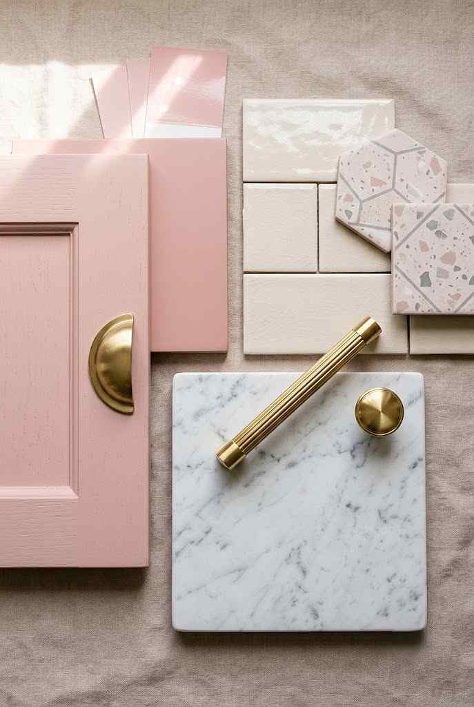
Paint alone doesn’t make a pink kitchen work. Texture saves it from feeling flat and one-dimensional.
Consider your cabinetry material: matte lacquer finishes on pink cabinetry absorb light and read as softer; glossy finishes bounce light around and feel more modern. Shaker-style cabinet doors with pink paint feel cottage-inspired, while sleek handle-less cabinetry in pink reads contemporary. You’re literally choosing the personality of your room through material choices.
Backsplashes matter too. Subway tile stays neutral and classic. Geometric tiles in complementary colors (blush with cream, or pink with gray) add visual interest. Here’s a question that stops people: would textured tile or smooth tile change how you feel in the space? Textured finishes catch light differently and add tactile depth.
Countertops should provide contrast or complement, depending on your goal. White or cream counters keep a pink kitchen feeling open. Black, charcoal, or deep green counters create drama. Marble or quartz with subtle veining works with almost any pink because it doesn’t compete for attention.
FYI: the materials you choose affect maintenance too. High-gloss finishes show fingerprints. Matte finishes hide them. That’s not design snobbery that’s just living with your space.
Hardware finish deserves its own conversation too. Matte black pulls against pink cabinetry create a bold, graphic look that reads modern and confident. Brushed nickel softens things and feels more transitional. Unlacquered brass develops a natural patina over time, which some homeowners love for the lived-in, evolving character it brings.
Open shelving versus closed cabinetry changes texture perception dramatically. Open shelves in pink show off dishware and glassware as part of the design, turning everyday items into decor. Closed cabinetry keeps things streamlined and hides the chaos useful if you’re not exactly a “curated shelf” kind of person like me. :/
Flooring texture matters just as much as color. Matte tile keeps a pink kitchen feeling grounded and calm, while polished or glossy tile amplifies brightness and can make a small kitchen feel larger than it is.
Lighting Changes Everything (Yes, Everything)
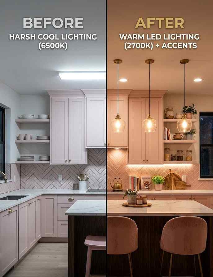
Here’s what nobody talks about: the same pink color looks completely different under different lighting. Warm, soft lighting makes pink feel luxe and cozy. Harsh, cool-toned lighting can make it feel washed out or artificial.
If you’re designing a pink kitchen, your lighting plan should come before your paint swatch. Install warm-temperature LED bulbs (2700K is the sweet spot). Under-cabinet lighting highlights the pink cabinetry and adds functional brightness for cooking. Pendant lights or a statement fixture above an island break up visual monotony and give your eye somewhere interesting to land.
Natural light matters equally. A pink kitchen with good morning sunlight feels different than one lit only by overhead fixtures at night. Before you commit to a pink shade, look at the room at different times of day in different weather. Yes, that’s thorough. Yes, it prevents regret.
Task lighting near your cooking zone isn’t optional in a pink kitchen it’s essential. Because pink surfaces reflect light differently than white or gray ones, shadows can look more pronounced without adequate task lighting directly over your prep areas and stove.
Dimmer switches are a small investment that make a massive difference. Being able to shift from bright, functional daytime lighting to a warm, moody evening glow means your pink kitchen can serve two completely different moods depending on the time of day.
Don’t forget about your window treatments either. Sheer curtains diffuse harsh sunlight and prevent pink cabinetry from looking overly saturated or hot during peak afternoon hours. Heavier drapes, on the other hand, block light more dramatically and work better in kitchens that get intense western exposure.
Pink Kitchens Work in Any Home Style
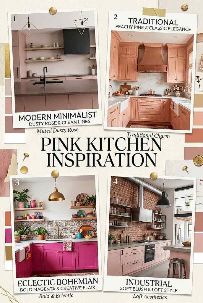
People assume pink kitchens are only for cottagecore aesthetics or maximalist interiors. Wrong. Pink kitchens adapt to whatever design language you’re actually living in.
In a modern home, a muted dusty rose with black hardware and minimalist lines reads sophisticated, not sweet. In a traditional home, a warmer peachy-pink with classic cabinetry details feels naturally at home. In an eclectic space, a bold magenta pink becomes the anchor that ties other colors together. Even in industrial lofts with exposed brick and concrete, the right shade of pink (usually a muted tone) humanizes the rawness.
The key is choosing the right depth and saturation of pink for your existing aesthetic, then sticking with it. Half-measures create confusion.
Coastal and farmhouse kitchens can pull off pink too, though people rarely consider it. A weathered, chalky pink paired with white shiplap and woven light fixtures feels breezy and relaxed rather than overly sweet. It’s proof that pink doesn’t automatically mean feminine or delicate it’s entirely about execution.
Small kitchens benefit from pink in a specific way: lighter pink tones on cabinetry can actually make a cramped space feel more open than stark white does, because pink adds warmth without the clinical coldness white sometimes brings. IMO, this is the most underrated use of pink in small-space design.
Large, open-concept kitchens can handle bolder, more saturated pinks since they have room to breathe visually. A hot pink island in a spacious kitchen becomes a striking focal point rather than an overwhelming choice.
Resale Value: The Question Nobody Wants to Avoid
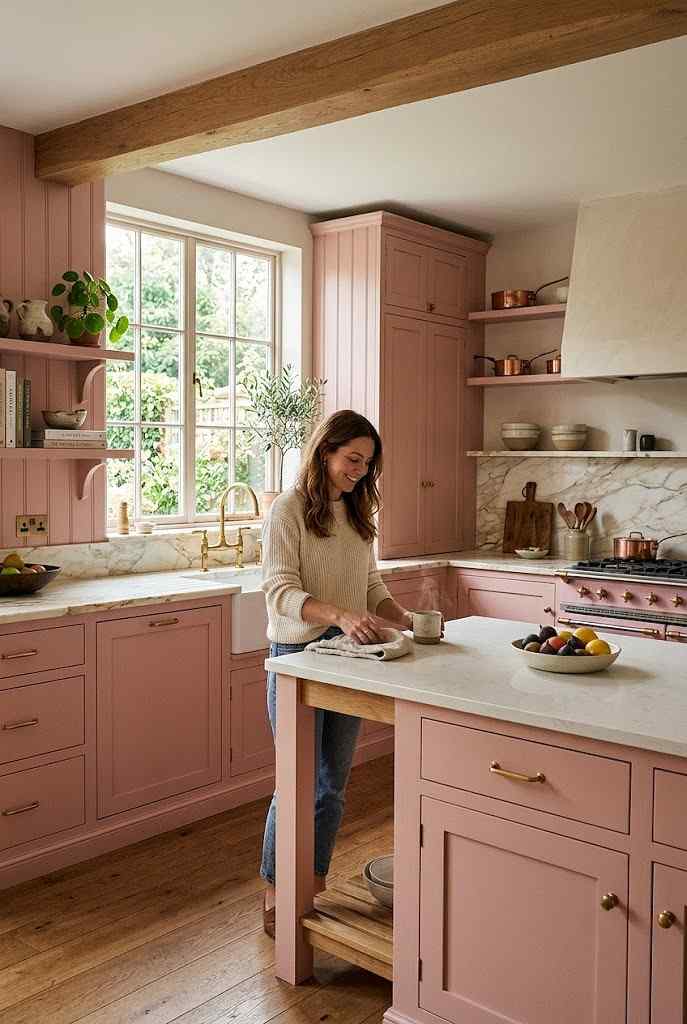
Let’s be honest: you probably care if your pink kitchen scares away future buyers. Should you?
Trendy kitchen colors absolutely affect resale value but usually only if they’re poorly executed or feel regrettable. A well-designed pink kitchen, especially one done with complementary materials, finishes, and hardware, reads as a designer choice, not a impulse mistake. Buyers who want a traditional kitchen can still appreciate the quality.
That said, painting over a pink kitchen is cheaper than replacing cabinetry. If you’re doing full pink cabinetry (not just walls), choose a shade that’s slightly less risky. Soft mauve reads more neutral than hot pink. Pale blush skews traditional. If you’re nervous, pink as an accent maybe an island or a single wall feels more reversible.
Honestly though? If you love it, live in it. Resale anxiety is the death of personal style.
Real estate agents increasingly report that unique kitchens generate more online engagement and showing requests, simply because they stand out in a sea of identical listings. A distinctive pink kitchen might actually draw more attention to your listing photos than a forgettable white one ever could.
If resale is genuinely your top priority, focus your pink on removable or updatable elements: a pink backsplash, pink bar stools, or pink pendant lights are far easier for future buyers to swap out than fully custom pink cabinetry. This gives you the look you want now without locking in a permanent commitment.
Consider getting a professional appraisal opinion before a major pink renovation if resale value keeps you up at night. Sometimes a quick conversation with a local agent puts your mind at ease more than endless online debates ever will.
FAQ’s
Are pink kitchens still trending in, or is this already fading out?
Pink kitchens remain trending, especially muted tones like mauve and dusty rose.
What’s the best pink shade for a small kitchen space?
Pale blush or soft pink tones make small kitchens feel open and warm.
Does a pink kitchen cost more to install than a standard white kitchen?
No, pink kitchens cost the same as any custom-colored cabinetry option.
Can I add pink to my kitchen without repainting all my cabinets?
Yes, try pink backsplashes, bar stools, or pendant lights as accents.
What cabinet finish works best with pink kitchen cabinetry?
Matte finishes suit soft pink tones; glossy finishes suit bold pink shades.
CONCLUSION
Pink kitchens work when they’re intentional. You can’t just throw color at a space and hope it lands. Think about why you’re drawn to pink, what shades actually make you happy, what materials support that vision, and how light interacts with everything.
The best kitchens pink or otherwise feel like they belong to the people living in them. A pink kitchen that makes you smile every morning is infinitely better than a “safe” beige kitchen that makes you feel nothing. Design trends come and go, but joy in your own space? That’s timeless.
What’s holding you back from trying pink? Seriously if it’s just fear of judgment, that’s a reason to do it. If it’s uncertainty about the right shade or execution, go hire a designer for a consultation. Either way, stop waiting for permission to make your kitchen yours.