
bedroom moodboard
By Anna Grace | 8 March 2026
How to Plan a Bedroom Moodboard That You’ll Actually Love
Picking paint swatches at random and hoping they magically become a cohesive bedroom is a bit like grocery shopping while hungry you end up with a cart full of things that don’t belong together. A bedroom moodboard fixes that problem before you spend a single dollar on furniture or fabric. It’s the planning step most people skip, and it’s usually why their “dream room” ends up looking more like a clearance aisle.
I learned this the hard way when I painted my own bedroom a moody navy blue without testing it against my existing wood furniture. The result? A room that looked like a cave rather than a cozy retreat. One moodboard would’ve saved me two weekends and a return trip to the paint store. So if you’re about to redecorate, here’s how to build a bedroom moodboard that actually works and why it matters more than you might think.
What a Bedroom Moodboard Actually Does For You
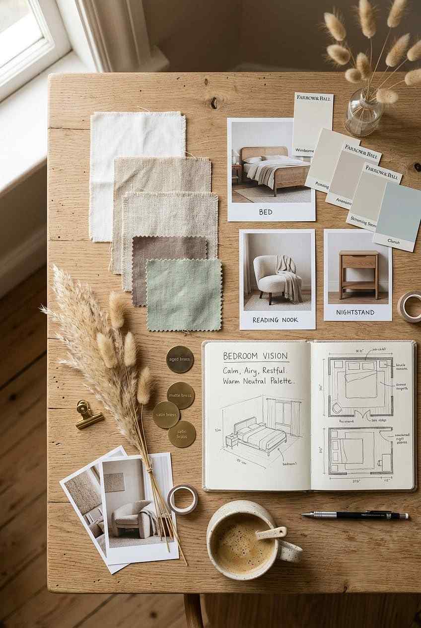
A moodboard isn’t just a pretty collage it’s a decision-making tool. It forces you to see your color palette, textures, and furniture style side by side before you commit to anything permanent. Think of it as a rehearsal for your room, minus the risk of buyer’s remorse.
Why does this matter so much for a bedroom specifically? Unlike a living room, your bedroom needs to balance aesthetics with rest. A space that looks stunning in photos but feels overstimulating at 11 p.m. isn’t doing its job. A moodboard lets you test whether your chosen colors and materials actually feel calming, not just Instagram-worthy.
A good moodboard answers three questions before you shop: what mood am I creating, what colors support that mood, and what textures bring it to life? Skip this step, and you’re decorating blind.
Choosing Your Bedroom Moodboard Theme
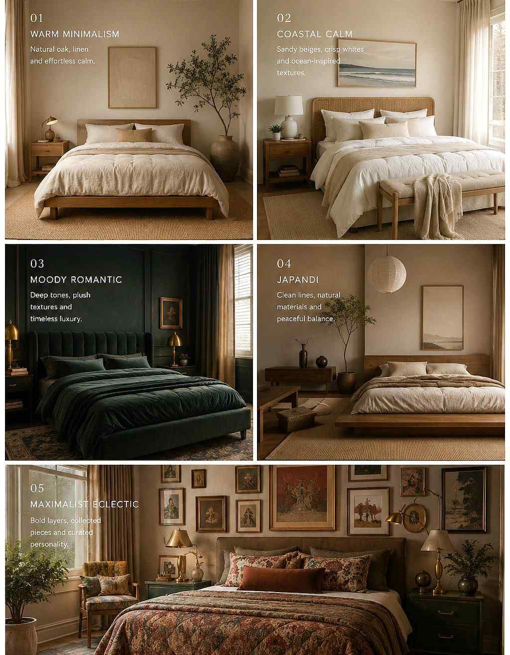
Every strong moodboard starts with a theme, even a loose one. This isn’t about picking a rigid style label and sticking to it religiously it’s about giving yourself a filter so you’re not pulled in ten directions by every pretty image you see online.
Here are a few popular directions to consider:
● Warm minimalism: neutral tones, natural wood, soft textiles, very little clutter
● Coastal calm: whites, sandy beiges, linen fabrics, light and airy vibes
● Moody romantic: deep jewel tones, velvet textures, brass or gold accents
● Japandi: a blend of Japanese simplicity and Scandinavian warmth, low furniture, muted colors
● Maximalist eclectic: bold patterns, mixed eras, layered textiles, art-heavy walls
Don’t feel pressured to pick just one. Plenty of the best bedrooms borrow from two categories say, warm minimalism with a touch of coastal calm. What matters is that your theme reflects how you actually want to feel when you walk into the room, not what’s trending on social media this month.
Ask yourself: do I want this room to energize me in the morning, or wind me down at night? IMO, most people underestimate how much their color choices affect sleep quality, so this question deserves real thought before you move forward.
Building the Moodboard: Tools and Techniques
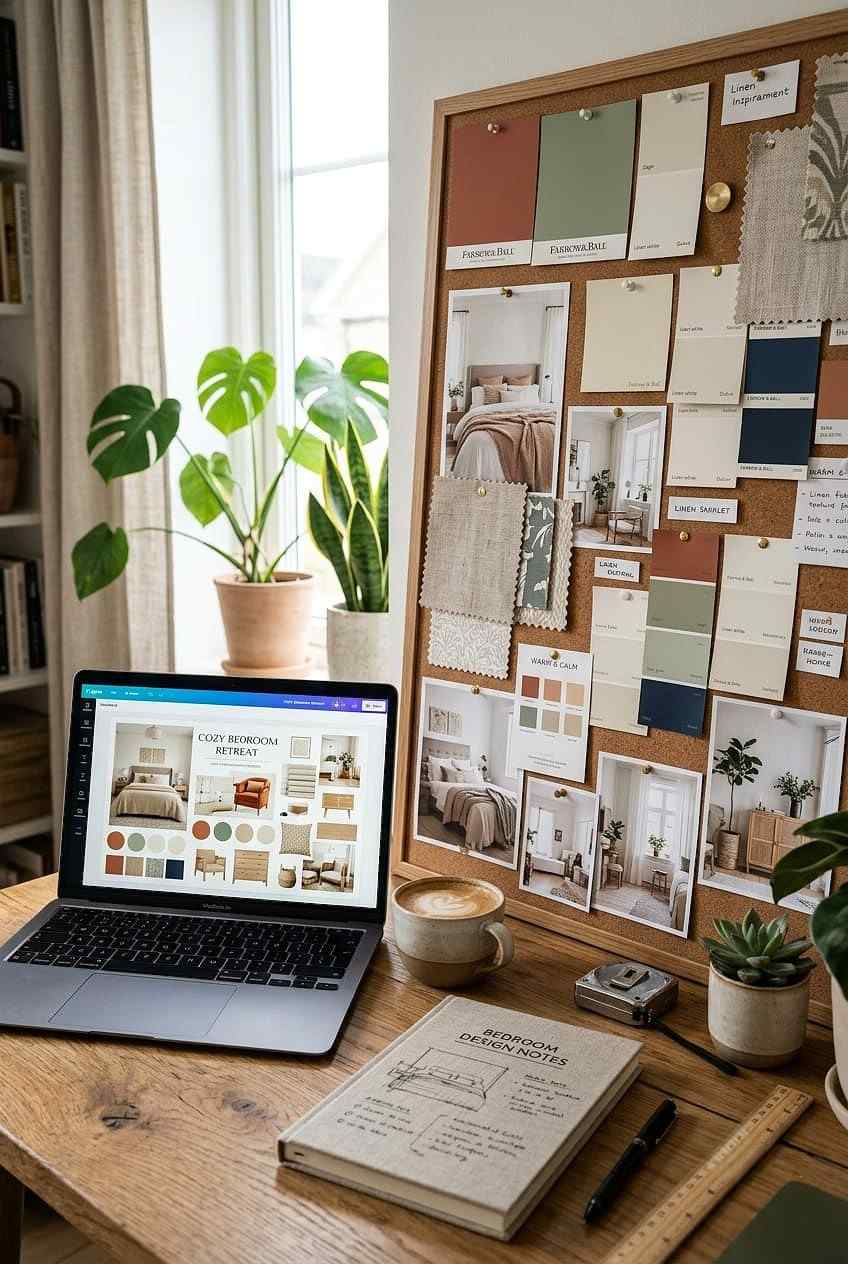
You’ve got two main paths here digital or physical and both work well depending on your style.
Digital Moodboards
Apps like Canva, Pinterest, and Milanote let you drag and drop images, paint swatches, and fabric samples into one visual board. This route is great if you’re pulling inspiration from online retailers or want to share the board with a partner or designer. Pinterest is especially useful because its algorithm learns your taste and starts serving up eerily on-point suggestions.
Physical Moodboards
Old-school corkboards or foam boards still have a place, especially if you’re working with actual paint chips, fabric swatches, or wallpaper samples. Physical materials show true color and texture in a way screens simply can’t replicate your monitor’s brightness settings shouldn’t be the deciding factor in a paint choice that’ll be on your walls for years.
Whichever method you choose, include these elements:
● Color palette: 3 to 5 core colors, including one accent
● Furniture inspiration: bed frame, nightstands, dresser style
● Textile samples: bedding, curtains, rug texture
● Lighting ideas: lamp style, overhead fixtures, natural light considerations
● Decor accents: art, mirrors, plants, personal touches
Layer these elements the same way you’d layer them in the actual room, with the largest surfaces (walls, bedding) taking up the most visual space on your board.
Common Bedroom Moodboard Mistakes to Avoid
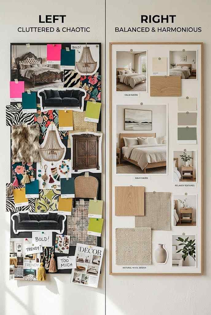
Even a well-intentioned moodboard can lead you astray if you fall into a few predictable traps.
Mistake one: ignoring your room’s natural light. A moodboard filled with cool grays might look chic in a photo, but if your bedroom only gets weak northern light, that same gray can turn flat and cold in real life. Always test your palette against your actual room’s lighting conditions, not just a screen’s backlight.
Mistake two: forgetting scale. It’s easy to fall in love with an oversized statement headboard on Pinterest, only to realize your bedroom is 10 feet wide. Measure your space before finalizing furniture choices on the board, not after.
Mistake three: chasing trends over comfort. Trendy color palettes shift every year remember when everyone wanted all-white everything, then suddenly it was terracotta and sage green? Your bedroom should hold up over time, so weigh trend appeal against long-term livability. Does this palette still feel right in three years, or is it a passing phase?
Mistake four: too many focal points. A room with five “statement pieces” competing for attention feels chaotic, not curated. Pick one hero element a headboard, an accent wall, a rug and let everything else support it quietly.
From Moodboard to Reality: Making the Shift
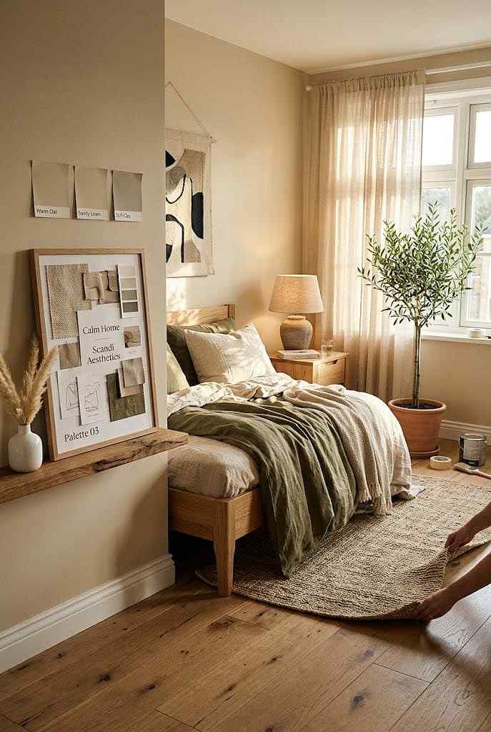
Once your moodboard feels right, resist the urge to buy everything at once. Start with the big-ticket items that anchor the room, like your bed frame, mattress, and wall color, since these set the tone for everything smaller. Nightstands, lamps, and decor can follow once the foundation is in place.
Before you finalize any paint color, test it. Buy sample pots and paint a few large swatches directly on your wall, then observe them at different times of day. Morning light and evening lamp light can make the same color read completely differently this single step would’ve saved me from my navy blue cave incident, no exaggeration.
FAQ’s
How many colors should a bedroom moodboard include?
Stick to three to five core colors, including one accent, to keep the palette cohesive and avoid visual overload.
Should I use a digital or physical bedroom moodboard?
Digital works well for sharing and browsing online inspiration; physical boards show truer color and texture for paint decisions.
Can a bedroom moodboard help with small spaces?
Yes, it helps you spot scale issues early, preventing oversized furniture purchases that overwhelm a compact room.
How do I know if my moodboard palette will work with my lighting?
Test paint swatches directly on your wall and observe them across different times of day before committing.
Is it okay to change my moodboard partway through decorating?
Absolutely! treat it as a flexible guide, not a final contract, and adjust once you see real materials in your space.
CONCLUSION
Treat your moodboard as a living document, not a locked contract. It’s totally normal to swap out a fabric or rethink an accent color once you see real materials in your actual space. The goal isn’t perfection on the first try; it’s giving yourself a clear enough direction that your final decisions feel intentional rather than random.
Redecorating a bedroom is a personal process, and your moodboard should reflect that. Whether you go full Pinterest board or old-fashioned corkboard, the point is the same: plan before you paint, and your future self the one trying to sleep peacefully in a room that finally feels like home will thank you. 🙂