
Green & blue livingroom
By Anna Grace | 28 feb 2026
Why Interior Designers Are Obsessed With Green and Blue Living Rooms (And Why You Should Be Too)
I walked into a friend’s living room last year and immediately felt like I’d stepped into a calm, expensive retreat despite knowing her budget was roughly equivalent to a used Honda Civic. The secret? Walls the color of seafoam, a deep teal accent chair, and enough plants to make you question whether you’d wandered into a botanical garden. That room changed how I think about color combinations, and honestly, it’s why I’m writing this.
Green and blue living rooms are having a moment but unlike most design trends, this isn’t a fleeting Instagram phase. These colors work because they tap into something deeper than aesthetics. They’re how nature calms you down. The ocean, the forest, the sky at sunset these combinations feel right at a biological level, which means your brain wants to relax the second you walk into the space. That’s not accidental. That’s strategic.
The beauty of this color duo extends beyond just looking good on Instagram. A green and blue living room becomes this natural sanctuary that your family actually wants to gather in no forced entertaining vibes required. You know those homes where everyone gravitates toward one specific room? That’s usually because something about the space feels right. These colors engineered that feeling without you having to overthink it.
Why Green and Blue Create Design Magic
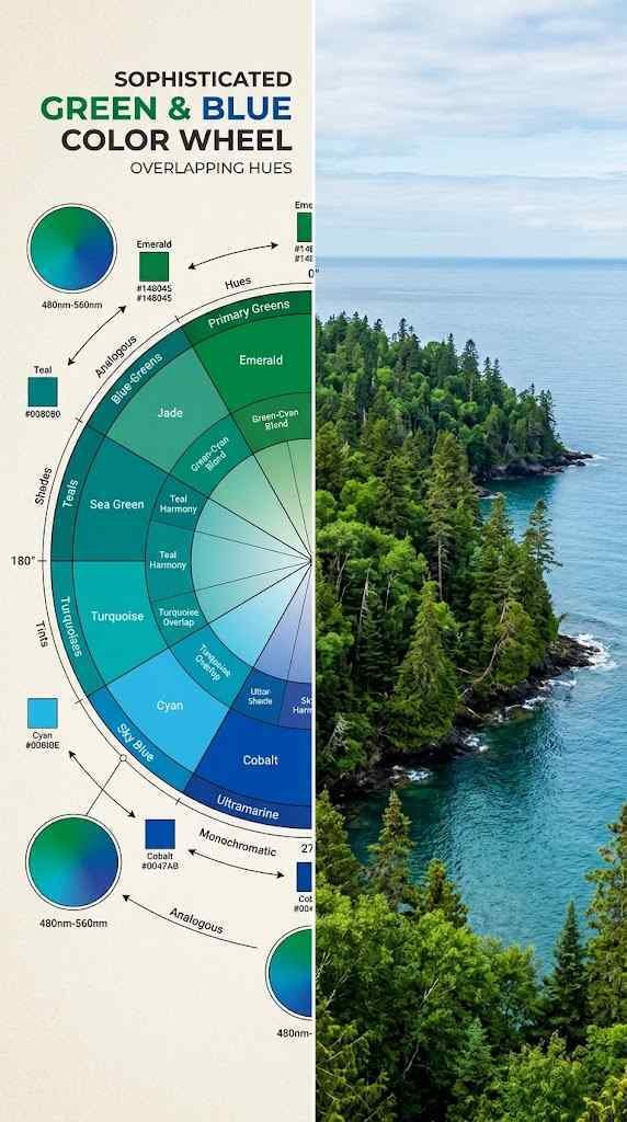
Here’s what most people get wrong they think green and blue are just “cool colors” so they must go together. Wrong. These colors succeed because they actually complement each other in ways that feel sophisticated rather than cold. Green brings warmth and life. Blue grounds everything and creates depth. Combine them, and you get this unexpected richness that makes your living room feel intentional.
The science is real, too. Your eye doesn’t struggle between these two hues they sit next to each other on the color wheel in a way that feels natural. It’s the difference between hearing two instruments that clash versus two that harmonize. Ever notice how peaceful you feel near water surrounded by vegetation? That’s no accident. Your brain recognizes that combination as “safe, stable, alive.”
The practical benefit? These colors hide imperfections better than light, neutral palettes. A little dust on a forest-green wall? Invisible. A small scuff on a blue accent wall? Who cares. This alone makes the combo superior for actual living (you know, where life happens).
Another reason this combo crushes it? Flexibility across seasons. Swap out heavy burgundy throw blankets for lighter linens in spring, and suddenly your green and blue living room feels fresh without needing a complete overhaul. Summer screams for whites and creams layered on top. Winter? Bring back the textures. The base color palette stays constant while the accessories tell you what season it is.
Real talk: this combination also photographs well for those moments when you actually want to share your space. Neutral rooms photograph flat. Overly saturated color rooms look artificial. But green and blue living rooms hit that sweet spot where they look like an actual home that real people inhabit, which makes them infinitely more interesting than sterile, perfect spaces that exist only in magazines.
Color Psychology, What These Shades Actually Do to Your Brain

Green is basically the therapist of the color world. It signals growth, renewal, and balance. Spend enough time surrounded by green, and your body genuinely relaxes cortisol levels drop, your nervous system chills out, blood pressure dips. IMO, anyone dealing with stress should seriously consider green in their main living space.
Blue is different. It’s the anchor. Blue creates trust, stability, and contemplation. It’s why corporate offices use it, why it’s the most universally preferred color worldwide, and why staring at it makes you feel like you have your life together (even when you absolutely don’t). When you pair blue with green, you’re basically creating an environment that says “You’re safe here, you’re balanced here, you can breathe here.”
The combination handles different moods too. Lean toward deeper tones, and you get moody sophistication. Go lighter with sage and sky blue, and suddenly you’re in a serene, almost meditative space. Neither is wrong both hit different depending on what you actually want from your living room. Is it a sanctuary for Netflix binges or a statement space for impressing people? The shade intensity answers that question.
The combo is especially powerful if you work from home. Spending eight hours in a green and blue environment versus gray or beige? Your mental load drops noticeably. You’re less irritable by 3 PM, you don’t stress-snack as much, and you actually want to stay in the space. This isn’t mystical it’s neurochemistry. Your brain literally functions better in these tones.
What’s wild is how this works across different personalities too. Introverts find the space restorative and protective. Extroverts feel energized rather than drained. It’s rare for a color scheme to feel welcoming to both people who want to hide out and people who want to host. That’s the magic of green and blue living rooms doing the heavy lifting.
Four Design Styles That Own This Color Combo
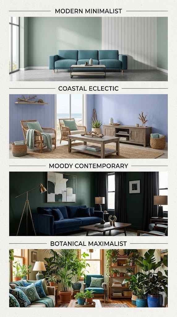
Modern Minimalist keeps it clean and intentional. Think soft sage walls, one statement blue sofa, white trim, and breathing room everywhere. The colors do the work while everything else stays quiet. This style proves you don’t need stuff to make a space feel designed.
Coastal Eclectic is basically “my living room is a vacation.” Washed blue walls, seafoam accents, natural wood, rattan textures, and maybe some plants that look like they’re judging your life choices. It’s relaxed but pulled-together the design equivalent of that friend who always looks effortlessly put-together.
Moody Contemporary goes darker and richer. Deep forest green, navy or teal accents, moody artwork, maybe some brass or gold fixtures. This style demands respect. It whispers, “I know what I’m doing.” Your living room becomes the place where everyone suddenly stops scrolling and actually has a conversation.
Botanical Maximalist embraces the green and blue as a backdrop for a plant-filled paradise. Varied shades, lots of greenery (actual plants, not just the color), layered textures, and enough visual interest that you could stare at the room for five minutes straight without getting bored. This one takes confidence because it risks feeling cluttered, but when it works, it absolutely works.
Beyond these four main styles, hybrids exist everywhere. Someone might blend Minimalist clarity with Botanical richness keeping the space uncluttered but letting plants do the visual storytelling. Others mix Coastal textures with Moody depth, creating something that’s relaxing but sophisticated. The point is that green and blue is the foundation flexible enough to support whatever your actual taste dictates.
The best approach? Spend time in spaces styled in each way. Visit showrooms, scroll design blogs, save Instagram photos that make you pause. Your gut will tell you which style actually fits how you live, not how you think you should live. That distinction matters more than any design rule.
The Practical Stuff, Making It Actually Happen
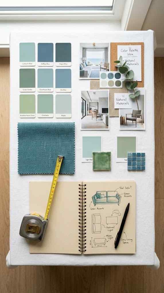
Start with one anchor piece. Most people stress about getting every color “right,” but the trick is choosing one major element first usually the sofa or walls. If you’re painting walls, commit to that color decision. If you’re keeping walls neutral, your sofa or area rug becomes the anchor. Everything else builds from there.
Balance matters, but it doesn’t mean equal. A living room that’s 60% blue, 30% green, and 10% neutrals usually hits better than trying to split everything down the middle. Your eye wants a visual hierarchy. One color should feel dominant, the other should surprise and support.
Lighting changes everything here. Green and blue in natural light read completely different than the same colors under warm artificial light. If your living room gets mostly evening light, test your paint samples at the actual time of day you’ll be in the space. This is genuinely not something to sleep on bad lighting can tank even a beautiful color scheme.
Texture is your secret weapon. A flat navy wall is boring. A navy wall with an accent of woven texture, a matte finish mixed with subtle sheen, or layered fabrics? That’s design. Green walls look richer with plants in front of them, blue sofas pop with varied pillow textures, and suddenly your living room feels expensive because it feels considered.
Another consideration: existing architectural features. Those green and blue accents will either highlight or compete with trim, molding, or built-ins you already have. Light wood beams read differently against navy than against forest green. Original hardwood floors might need a warm neutral bridge color if your walls skew too cool. Walk through your space at different times and imagine each wall color in place. This takes thirty minutes and saves you from expensive mistakes.
Budget-wise, don’t feel like you need designer furniture to make this work. A $300 sofa in the right shade of teal, paired with thoughtful throw pillows, plants, and good lighting, outperforms a $3,000 generic beige sofa every single time. Green and blue living rooms actually reward creativity and restraint more than they reward spending power.
The Mistakes Everyone Makes (And How to Dodge Them)
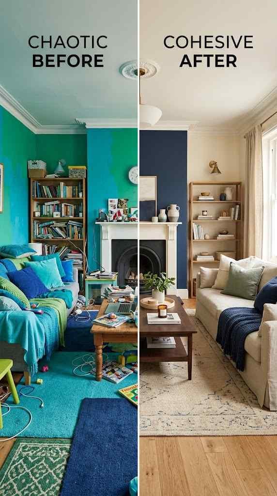
Using too many competing shades. The moment you add turquoise AND teal AND navy AND sage AND forest green, your space feels confused. Stick to two, maybe three main shades maximum, then bring in neutrals. Simplicity reads as sophistication.
Forgetting about warm neutrals. A green and blue room needs something to prevent it from feeling cold. This is where cream, warm gray, natural wood, or even terracotta accents save the day. Think of neutrals as the glue that makes everything feel cohesive rather than themed.
Not considering the room’s actual function. A deep blue and dark green bedroom is moody and romantic. The same color combo in a living room where you host dinner parties? Might feel a bit cave-like. Match intensity to purpose.
Underestimating accessories. Your paint color is permanent-ish (okay, you can repaint, but you won’t). Your sofa is a multi-year investment. But throw pillows, artwork, plants, and lighting? These are how you finesse the vibe. If your first instinct is wrong, these fix it.
One more pitfall worth mentioning: ignoring your room’s existing light situation before committing. A north-facing living room that rarely sees direct sun needs warmer undertones in both green and blue think sage and periwinkle rather than cool forest and navy. A south-facing room that gets blasted with afternoon light can handle richer, deeper tones without feeling gloomy. Get samples on your actual walls and live with them for a week. Paint looks different on day three than day one.
Also, don’t underestimate the power of finishing hardware and fixtures. Switch plates, outlet covers, door handles, and light fixtures in finishes that complement your palette (brushed gold, matte black, or natural brass) elevate the whole scheme instantly. These small details sound silly until you realize they’re the difference between “nice living room” and “this person has their aesthetic figured out.”
FAQ’s
Can I use green and blue in a small living room without making it feel cramped?
Yes! use lighter shades, keep one wall neutral, and maximize vertical space with plants and shelving to maintain airiness.
What neutral colors work best with a green and blue living room?
Warm whites, creams, soft grays, and natural wood tones balance cool hues without competing for visual attention or feeling sterile.
How do I choose between painting walls or using furniture as my green and blue anchor?
Consider permanence, painted walls commit long-term, while sofas and rugs offer flexibility if your taste evolves over time.
Does a green and blue living room work with traditional or only modern design styles?
Both! these colors adapt beautifully to traditional, contemporary, coastal, eclectic, and transitional design depending on shade and accessories chosen.
What’s the best way to add green and blue to a living room I rent and can’t paint?
Use removable wallpaper, large area rugs, statement furniture, layered textiles, and potted plants to build the aesthetic without permanent changes.
CONCLUSION
Green and blue living rooms work because they’re both beautiful and functional. They calm you down, they make your space feel intentional, and they’re flexible enough to fit basically any design style. Your living room is where you spend actual time not just the backdrop for a photo. Colors that make you feel good aren’t luxuries; they’re necessities disguised as decoration.
The question isn’t whether green and blue will work in your space it’s which shades and which style will make you actually want to be there. Start with that, trust the process, and watch what happens. Your living room is waiting to become the room you didn’t know you needed.