
kitchen cabinet color ideas
By Anna Grace | 15 March 2026
Kitchen Cabinet Color Ideas That Transform Your Space Without a Full Renovation
Your kitchen cabinets likely consume more visual real estate than any other single element in your kitchen, yet most people spend about five minutes deciding their color and then agonize over it for the next decade. That contradiction deserves fixing.
Cabinet color shapes everything how bright your kitchen feels, whether it reads as cozy or spacious, whether guests actually want to hang out there, and honestly, how much you’ll enjoy making breakfast on a Tuesday morning. It’s not just paint. It’s the backdrop to your entire cooking life.
Why Your Cabinet Color Carries More Weight Than You’d Think
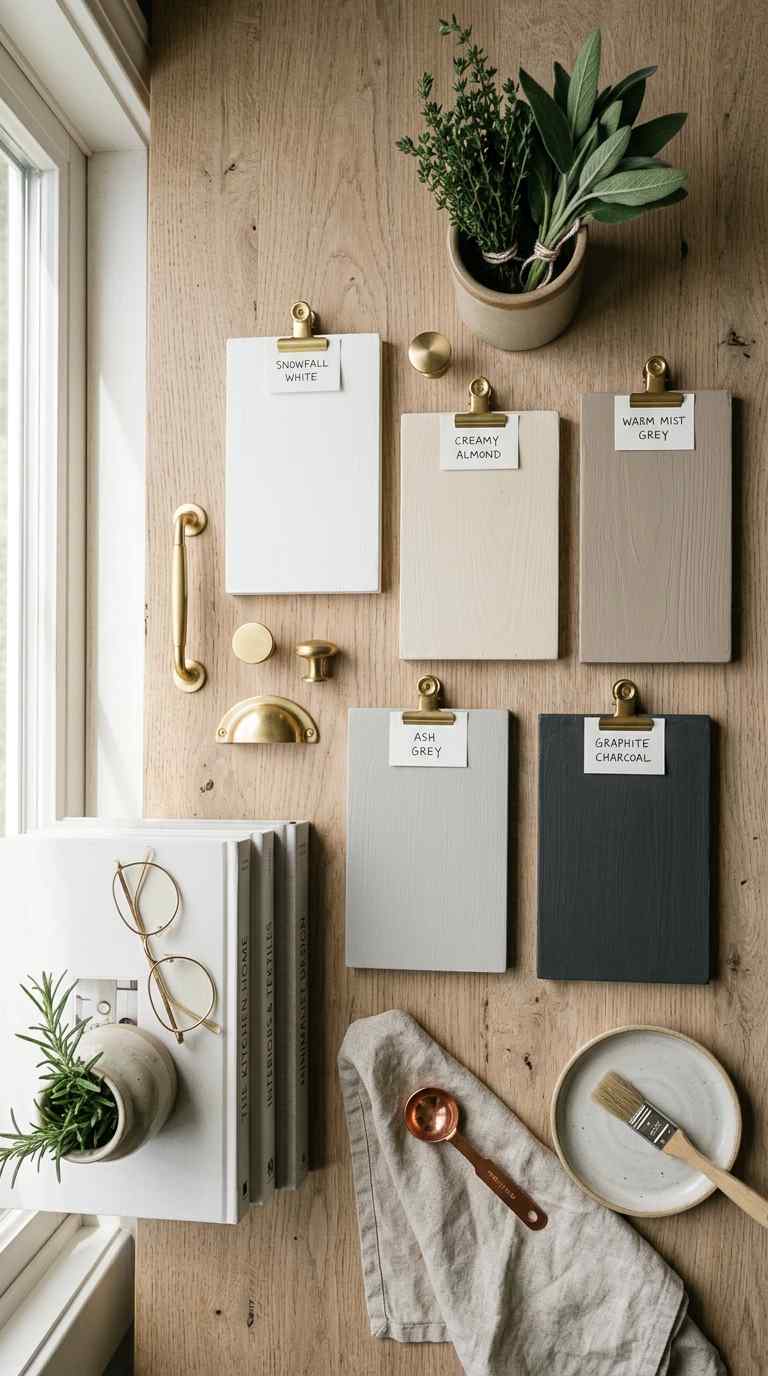
Here’s what catches people off guard: your cabinet color influences mood more than wall color does, because cabinets occupy that critical middle zone in your visual field. You see them constantly but not always consciously. Walk past a kitchen with caramel-colored cabinets versus one with crisp white cabinets, and your nervous system registers something completely different even if you can’t articulate what.
The color you choose for your kitchen cabinets also affects how large or small the space reads. Lighter cabinet colors expand perception, dark tones anchor and define. IMO, this single decision shapes how functional your kitchen feels daily far more than whether you splurged on the fancy faucet. A cabinet color you hate will wear on you months into your new kitchen. A cabinet color you love? That carries you through years of chopped onions and spilled flour.
Your cabinets also sit at the intersection of style and resale value, which means you’re navigating both personal preference and practical considerations simultaneously. No pressure, right?
There’s also a psychological layer most homeowners never consider: your cabinet color influences your relationship with the kitchen long-term, not just your first impression. Think about it this way you’ll open these cabinets hundreds of times a month for years. A color that feels exciting on day one but grating by month six creates low-level friction every single time you reach for a plate.
I learned this the hard way with a rental kitchen years back. The landlord chose a mustard-yellow cabinet color that photographed beautifully but made the actual space feel claustrophobic by week three. Lesson learned: photos lie, lived experience doesn’t.
Your cabinet color also interacts with your home’s natural light patterns throughout the seasons, something static paint chips can never fully capture. A color that glows in summer might feel flat and lifeless come January. This is exactly why professional designers insist on testing samples across multiple days and weather conditions before finalizing anything.
The Timeless Neutrals That Anchor Everything
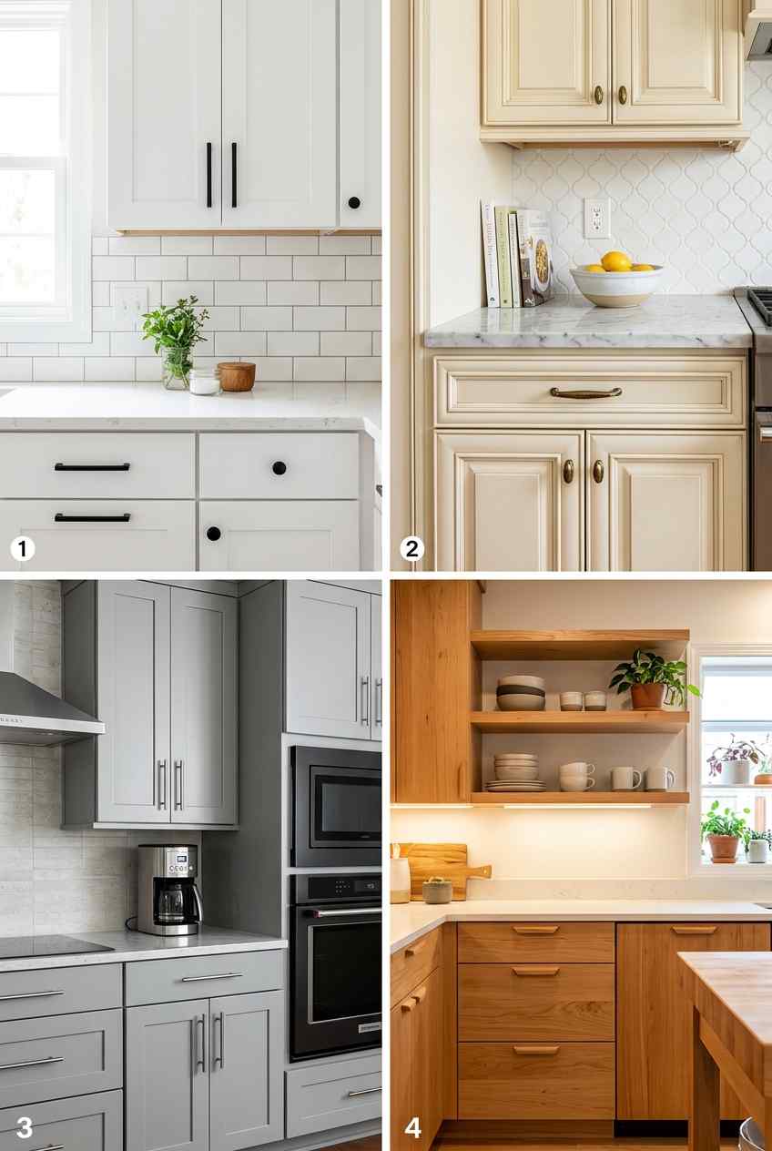
White cabinets remain the most reliable option precisely because they function like visual silence they let everything else in your kitchen be the star. They expand smaller kitchens, pair with literally any countertop or backsplash, and adapt as your style evolves. Pure white reads contemporary cream-white feels warmer and more forgiving. The catch? White shows every fingerprint, dust particle, and splatter. If you’re the type who notices these things, consider cream or off-white instead, which performs the same visual trick with slightly more forgiveness.
Gray kitchen cabinets have muscled their way into the neutral rotation for solid reasons. Cool grays feel modern. Warm grays feel balanced. Greige (that gray-beige hybrid) bridges the gap between contemporary and cozy. The danger with gray is that it can feel cold if you choose the wrong undertone, so bring actual paint samples home and observe them under your kitchen lighting at different times of day this isn’t optional homework.
Black or charcoal cabinets represent the sophisticated third option in neutral territory. They demand good lighting and confident design choices, but they reward both with drama and elegance. Black cabinets make a statement that your kitchen isn’t generic, which appeals to people willing to maintain them more carefully.
Wood-tone cabinets honey, oak, cherry, walnut technically live in neutral territory too, though they’re warmer by nature. FYI, light wood reads transitional; dark wood reads traditional or transitional depending on hardware and style choices. Warm wood tones are having a genuine revival after years of gray dominance.
Beyond the big four (white, gray, black, wood), there’s a quieter neutral gaining serious traction: warm taupe cabinets. Taupe splits the difference between gray’s coolness and beige’s warmth, giving you a genuinely chameleon-like base that adapts to whatever countertop or backsplash trend comes next. It’s basically the diplomatic negotiator of cabinet colors pleases everyone, offends no one.
Another underrated neutral move? Two-tone neutral pairings, like white uppers with warm gray lowers, or cream perimeter cabinets with a contrasting wood-tone island. This approach delivers visual interest without committing to a single bold statement, which appeals to people who want personality but aren’t ready for full commitment. IMO, two-tone neutrals offer the best return on design risk low stress, high payoff.
Don’t underestimate sheen level either. Matte finishes feel contemporary and forgiving of imperfections, while satin or semi-gloss reflects more light and shows every smudge. Your neutral color choice matters, but your finish choice matters almost as much.
When You’re Ready to Actually Take a Risk
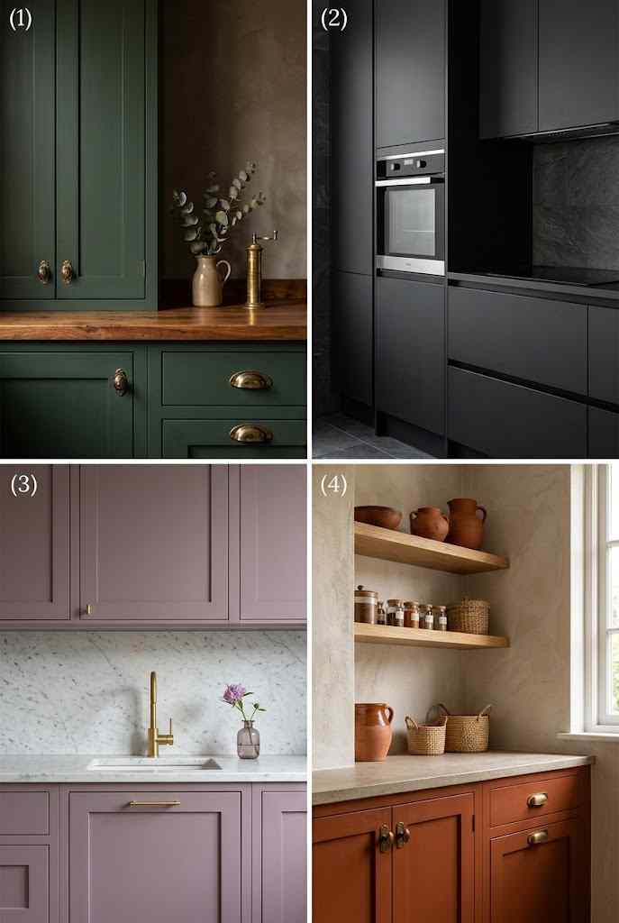
Here’s where kitchen cabinet colors get interesting: the moment you step away from neutrals.
Navy and deep blue cabinets transformed from “bold choice” to “totally legitimate” in the last five years. Navy reads sophisticated, stable, almost professional think high-end European kitchens. It pairs beautifully with brass or gold hardware, marble countertops, and open shelving. Pair navy with white subway tile and you’ve got instant elegance.
Green kitchen cabinets forest green, sage green, olive bring warmth and personality without the chaos of brighter colors. Green whispers “I’m thoughtful about design” while remaining practical. It works particularly well in kitchens with natural light, because the colors actually deepen and shift throughout the day rather than sitting static and dull.
Soft, muted blue-greens (teal-adjacent territory) split the difference between calm and presence. These colors feel collected, like someone actually considered the space rather than defaulting to white.
Warm colors terracotta, rust, warm taupe demand more confidence but deliver serious personality. Use these if your kitchen gets strong natural light and you genuinely love the color. A burnt orange kitchen you tolerate is a kitchen that ages you hourly.
If full commitment to a bold cabinet color still feels intimidating, there’s a middle path worth considering: color only on the island. This lets you experiment with navy, emerald, or burgundy without repainting your entire kitchen’s perimeter. It’s essentially a design safety net maximum impact, minimum long-term risk.
Burgundy and deep wine tones deserve a mention too, especially for kitchens craving old-world richness paired with contemporary hardware. These deep reds photograph beautifully in candlelight and pair surprisingly well with brass fixtures and warm wood flooring.
For the genuinely fearless, two-tone bold combinations like navy lowers with sage uppers create a curated, collected-over-time aesthetic that feels intentional rather than trendy. Just make sure your two colors share an undertone family (both warm or both cool) so they complement rather than compete visually.
Matching Cabinet Color to Your Kitchen’s Actual Personality
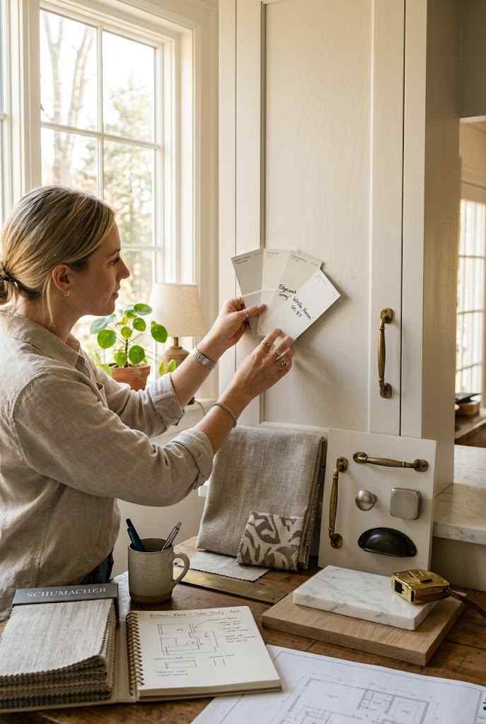
Your kitchen doesn’t exist in a vacuum, which means cabinet color needs to harmonize with your countertops, backsplash, flooring, and overall home style.
Contemporary kitchens typically lean toward white, black, gray, navy, or deep green. Clean lines and neutral palettes let minimalist design breathe. Bold color needs restraint in contemporary spaces use it as accent rather than dominating statement.
Transitional kitchens (modern + traditional hybrid) thrive with greige, warm gray, wood tones, or soft greens. These spaces want sophistication without severity. Slightly warmer neutrals feel more grounded here.
Traditional kitchens welcome wood tones, creams, whites, and even deeper colors like navy or forest green. Traditional spaces can actually carry stronger cabinet colors because the overall aesthetic already has more visual weight.
Farmhouse and rustic kitchens sing with white, cream, weathered wood, or soft greens. These spaces invite warmth and a slightly aged-in-the-best-way aesthetic.
Modern kitchens demand commitment black, bold jewel tones, or brave color combinations. Modern design doesn’t apologize, so your cabinets shouldn’t either.
The actual rule? Your cabinet color should reflect the kitchen’s overall direction rather than contradict it. :/
Coastal and Mediterranean-inspired kitchens deserve their own mention here, since they don’t fit neatly into the categories above. These spaces thrive with soft blues, seafoam greens, and weathered whites that evoke sun-bleached textures and ocean-adjacent calm. Pair these tones with natural stone or woven textures for an effortless, breezy feel.
Industrial-style kitchens, meanwhile, lean into charcoal, matte black, or deep steel-gray cabinets that echo exposed brick and metal fixtures. The goal here isn’t softness it’s intentional edge. If your kitchen already features concrete countertops or exposed ductwork, fighting that aesthetic with pastel cabinets creates visual dissonance rather than harmony.
Ultimately, your existing architectural bones should guide the decision more than any single trend report. A 1920s bungalow kitchen and a glass-walled new-build call for entirely different cabinet personalities, even if you personally love the same color in theory.
Three Things to Verify Before You Actually Commit Paint to Wood
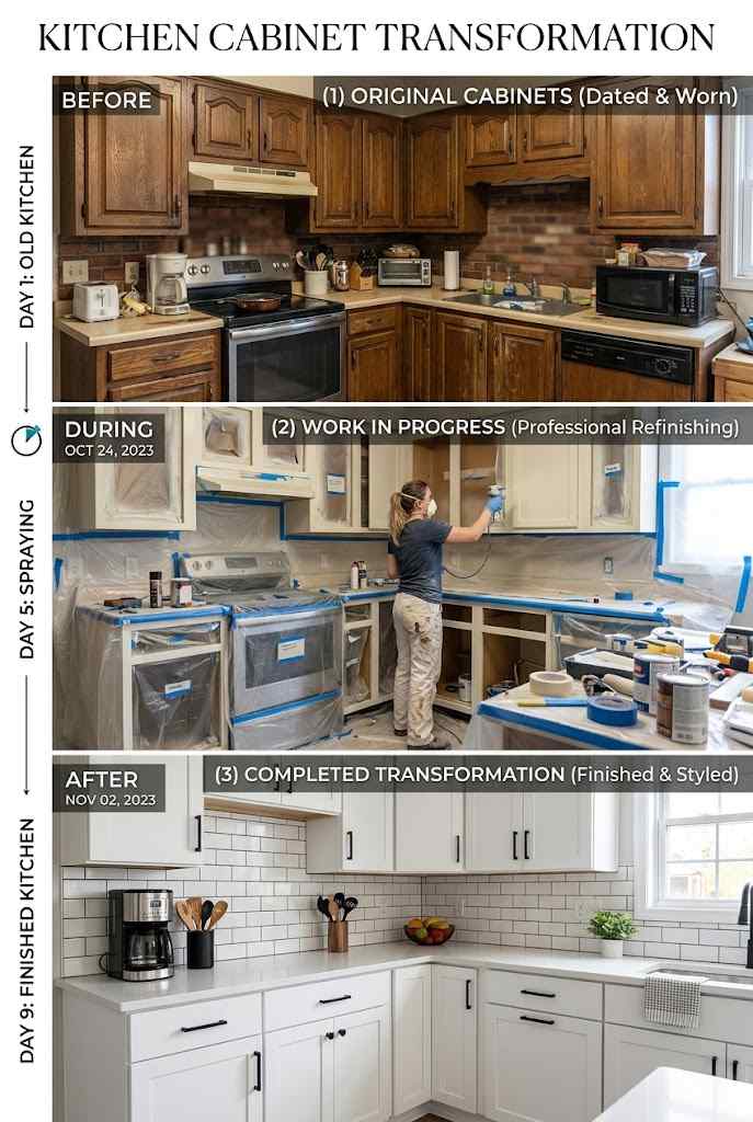
Cabinet color decisions are semi-permanent (you can repaint, but that requires effort and money and decisions about hardware). Worth thinking through:
Lighting changes everything. Warm bulbs make cool grays look dingy. Cool LED makes warm cream look sickly. Observe paint samples under your actual kitchen lighting at morning, afternoon, and evening hours. This sounds obsessive until you’ve painted your cabinets the wrong color.
Consider your resale moment someday. White, soft gray, navy, and wood tones have proven staying power in real estate. Burnt orange, while magnificent, narrows your future buyers’ enthusiasm. This doesn’t mean avoid all color it means choose colors that are beloved enough to outlast trends.
Hardware really matters. The same cabinet color reads completely different with brushed brass versus black hardware versus nickel. Finalize your hardware vision before committing to paint color, because they’re partners.
One more practical consideration: sample size matters more than people realize. Don’t rely on a tiny paint chip to make a decision this significant. Paint large poster-board sections (or better yet, actual cabinet doors) and prop them in your kitchen for at least a week. Small chips lie about how a color behaves at scale.
Budget for professional application if you’re going bold or dark. DIY cabinet painting often shows brush strokes and uneven coverage, which reads fine with forgiving whites but becomes glaringly obvious with deep navy or matte black. A professional spray finish creates that smooth, factory-level result worth paying for.
Finally, talk to your kitchen designer or painter about trending versus timeless before finalizing anything. Trends shift every few years, but genuinely well-executed cabinet colors regardless of shadetend to age gracefully when paired with quality hardware and thoughtful lighting.
FAQ’s
What’s the most popular kitchen cabinet color right now?
White and warm gray remain top choices, though navy and sage green are rapidly gaining popularity too.
Do dark kitchen cabinets make a small kitchen look smaller?
Yes, generally but good lighting and reflective surfaces can offset this effect significantly.
Should kitchen cabinet color match the flooring?
Not exactly match, but they should share complementary undertones for visual cohesion throughout the space.
How long does painted kitchen cabinet color typically last before needing a refresh?
Quality paint jobs last 8-10 years with proper care and minimal daily wear.
Can I mix two different cabinet colors in one kitchen?
Absolutely two-tone kitchens are trending, especially pairing neutral perimeters with a bold island color.
CONCLUSION
What color do your kitchen cabinets actually deserve? Not what’s trendy, not what played well in someone else’s Pinterest board what would genuinely make you excited to wake up and start cooking there? That instinct matters more than any design rule. Find that color, live with samples for two weeks, then commit confidently. A kitchen where someone hedged every bet feels dated and indecisive faster.
Trust yourself. If the combo speaks to you and makes sense for your space, your lighting, and your lifestyle, commit to it.