
livingroom color palette
By Anna Grace | 4 feb 2026
The Living Room Color Palette Decision You’re Probably Making Wrong
Your living room probably isn’t getting the color treatment it deserves. I say this not as a condemnation but as an observation most people treat their living room like it’s a blank canvas they stumbled into, rather than an opportunity to craft something genuinely good.
Here’s the thing color doesn’t just decorate a room. It determines whether you feel relaxed or energized when you walk through the door. It influences whether guests feel welcome or slightly uncomfortable. It even affects how long you actually want to spend in that space. And yet, so many of us make color decisions based on what’s trending on Instagram or what samples we grabbed at the hardware store.
The right living room color palette changes everything. The wrong one makes a beautiful space feel off in ways you can’t quite name.
The Psychology Behind What You See

Colors trigger actual psychological responses this isn’t mystical stuff, it’s science. When you choose a living room color palette, you’re essentially programming the mood of the room before anyone even sits down.
Cool tones like blues and greens activate your parasympathetic nervous system, which is the fancy way of saying they calm you down. Warm tones like oranges, reds, and yellows do the opposite they energize and stimulate. Neutrals create a sense of order and control. This matters because your living room is probably where you collapse after a long day, so you need to think carefully about what emotional frequency you want that space running on.
IMO, most people get this wrong because they’re thinking aesthetically instead of functionally. A gorgeous burnt orange accent wall looks fantastic in a photo, but will it feel welcoming at 9 PM when you’re mentally exhausted? That’s the real question.
The light in your room also plays a huge role that people constantly overlook. Natural light, artificial light, the angle of your windows all of it transforms how colors actually appear. A soft grey in bright morning light looks totally different under recessed lighting at night. Test your colors at different times of day before you commit. This is non-negotiable.
One more layer worth considering: saturation and intensity dramatically shift how colors feel psychologically. A muted sage green whispers serenity, while a vibrant lime screams energy. Most people don’t think about saturation levels when they’re choosing they just grab a color and hope it works. But here’s what actually matters: desaturated colors (softer, less pigmented) generally feel more sophisticated and calming, while highly saturated colors demand attention and create visual intensity. If your living room is already busy with furniture, artwork, and decor, a less saturated color palette gives everything room to breathe. If your room is minimal and needs personality, more saturated tones punch harder.
Popular Living Room Color Palette Styles (Without the Pretension)
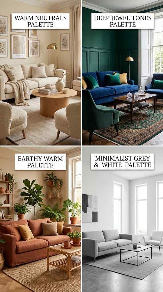
There’s no single “right” living room color palette which is actually freeing if you stop thinking of trends as commands.
Warm neutrals remain the safest bet for a reason. Creams, beiges, and soft taupes create an inviting foundation that works with basically any furniture style. They’re flexible, they age well, and they don’t scream “I painted this in 2024.” The downside? If you go too safe, your room risks feeling boring.
Deep jewel tones emerald, sapphire, rich plum have exploded in popularity recently, and honestly, when they’re done well, they’re stunning. These palettes work beautifully in rooms with good natural light and make spaces feel sophisticated without trying too hard. The catch is that you need enough natural light or they’ll feel cave-like, which is exactly what you don’t want in a living room where you probably host people.
Earthy, warm palettes (terracottas, ochres, warm browns) bring a grounded, almost botanical feel. These work especially well if you’re into plants, natural materials, and that whole organic aesthetic. They photograph beautifully too, which isn’t the only reason to choose them, but it’s a nice bonus.
Minimalist grey-and-white combinations appeal to people who like clean lines and breathing room. These palettes make small living rooms feel bigger and work with modern furniture. But they can also feel cold if you don’t balance them with warm accents wood tones, brass fixtures, or layered textiles become essential.
The “maximalist approach” multiple bold colors working together takes serious confidence to pull off. If you do it right, your living room becomes genuinely memorable. If you don’t, it becomes visual chaos that exhausts everyone who enters. Fair warning.
The thing nobody tells you about trendy living room color palettes is that they require maintenance and intentionality to age well. That jewel-tone accent wall? Stunning now, but in five years it might feel dated if you don’t evolve the accessories around it. Warm neutrals have staying power precisely because they’re flexible they work with last year’s decor and next year’s too. This doesn’t mean avoid trendy colors, but go in knowing you might need to refresh supporting elements (pillows, art, lighting) sooner rather than later. Budget accordingly.
How to Actually Choose (Instead of Just Guessing)
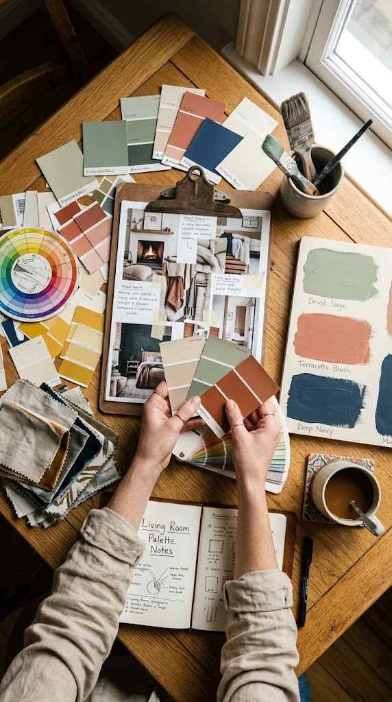
Start by considering the non-negotiables in your space. What furniture are you keeping? What artwork do you already own? What’s the quality of light coming through your windows?
Your living room color palette should enhance what’s already there, not fight against it. If you have a statement sofa you love, your wall colors should complement it, not compete with it. If your room gets mostly indirect light, dark colors will need artificial light support to prevent the space from feeling gloomy.
Next, honestly assess how you want to feel in this room. Not how it’s “supposed” to feel how you actually want to feel. Are you creating a cozy retreat or a vibrant gathering space? Do you want energy or peace? These aren’t trick questions. Your answer determines your direction.
FYI paint chips lie. They look different on your walls than they do in the store or on your phone. Buy a quart of your top three colors and paint large swatches on different walls. Live with them for a few days. Morning light, afternoon light, evening light see how they change. This feels tedious, but it’s genuinely the only way to make a decision you won’t regret in six months.
Consider creating a mood board not on Pinterest, but physically. Gather fabric swatches, paint samples, photos of spaces that resonate with you. Tape them together on a large piece of paper and look at it every day. What patterns emerge? What colors show up repeatedly? Your instincts are telling you something.
Budget plays a role here that people often avoid discussing. If you’re renting or unsure about your long-term plans, choosing a neutral living room color palette gives you flexibility you can change it easily without major investment. If you own and you’re committed to staying put, that’s when bolder color choices make sense because you can layer in custom pieces that work specifically with your palette. There’s no shame in picking safe colors because of financial constraints; there’s wisdom in it actually.
The Mistakes That Keep Happening
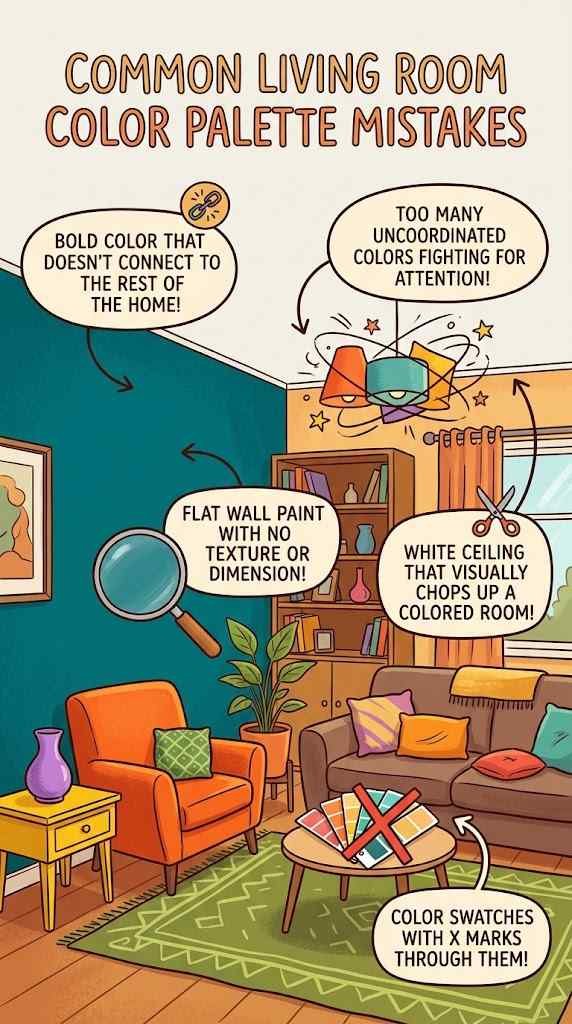
One massive mistake is choosing colors in isolation instead of considering how they work with the rest of your home. Your living room doesn’t exist in a vacuum it connects to hallways, kitchens, bedrooms. If your color palette creates visual chaos when you move between spaces, the whole effect falls apart.
Another common misstep using too many colors without a clear framework. Three to four main colors (including neutrals) is typically the sweet spot for a living room. More than that and you’re essentially decorating with every color, which paradoxically makes you feel less intentional.
People also underestimate how much ceiling and trim color matter. Painting walls a rich color while leaving the ceiling white can chop up the space visually. Sometimes bringing your wall color slightly onto the ceiling (or matching ceiling to walls) creates better flow and makes the room feel more cohesive.
And then there’s the texture question that everyone forgets. A flat wall color is just a flat wall color. Adding texture through paint finish, textured wallpaper, or layered fabrics and materials brings dimension that straight color choices can’t achieve alone.
Room size also plays into color decisions in ways that merit attention. Darker living room color palettes in compact spaces can feel intimate and sophisticated, but they demand excellent lighting to avoid feeling cramped. Lighter palettes expand smaller rooms visually, which is why they’re often recommended for apartments or cozy spaces. Larger rooms can handle darker tones without losing functionality. Before you commit to a color, measure your space mentally and think about how that shade will behave in your specific dimensions and lighting conditions.
Making It Work in Real Life
Once you’ve landed on your living room color palette, you still need to execute it thoughtfully. Paint quality matters more than most people believe. Cheap paint shows brush marks, doesn’t cover evenly, and fades faster. Better paint costs more upfront and pays dividends in how your colors actually look.
Use your accent colors strategically. Not every surface needs to be the feature color. Often one accent wall, or pulling the color into artwork and accessories, creates more impact than saturating the entire room. This also makes future changes easier if your taste evolves.
Layer your colors with materials and textures. A living room color palette becomes three-dimensional when you add wood finishes, metallic accents, natural fabrics, and varied paint sheens. Matte, satin, and semi-gloss finishes in complementary colors create visual interest that solid color alone won’t achieve.
If you’re not confident making these decisions solo, hiring a color consultant or interior designer doesn’t mean you’ve failed it means you’re outsourcing expertise you don’t have, which is entirely reasonable. A professional can look at your space, your light, your existing pieces, and your lifestyle, then recommend a living room color palette that actually works instead of just looking good on Instagram. Even one consultation can save you from expensive color mistakes down the road.
FAQ’s
How do I know if a living room color palette will look good before painting?
Test paint swatches on all walls for several days in different lighting. Observe how colors shift from morning, afternoon, and evening light before committing.
Can I use a bold living room color palette in a small space without making it feel cramped?
Yes! use bold colors on a single accent wall and keep surrounding walls neutral. Layer with mirrors and good lighting to maintain openness and visual flow.
What’s the best living room color palette for rooms with low natural light?
Warmer, lighter tones and soft whites work better than dark colors. Pair them with bright artificial lighting and reflective surfaces to compensate for limited daylight.
How often should I refresh my living room color palette to stay current?
Paint lasting 5–7 years before feeling outdated. Refresh accessories (pillows, art) yearly if desired. Complete repaints depend on personal preference, not trend cycles.
Should my living room color palette match the rest of my home or be completely different?
Create visual flow with compatible undertones between rooms, but allow each space its own identity. Harsh color transitions between spaces feel jarring and intentionally chaotic.
CONCLUSION
Here’s what I genuinely believe: your living room color palette should make you feel something every single time you walk into that space. Not Instagram-approved, not trend-coded, but actually good. The moment you stop thinking about pleasing other people’s aesthetics and start thinking about your own comfort, everything gets easier.
The best living room color palettes aren’t always the most daring or the most fashionable they’re the ones that work for how you actually live. If you’re someone who reads in that room every evening, warm lighting paired with calming colors matters more than a bold statement. If that’s your gathering space for parties, brighter or more energizing tones might serve you better.
Color changes everything. Now go look at your living room walls and ask yourself honestly does this space feel like you? If the answer is no, you know what to do.