
Mid century bathroom
By Anna Grace | 19 June 2026
Mid Century Bathroom Ideas That Still Beat Every Trend on Pinterest
My grandmother’s bathroom had mint green tiles, a floating walnut vanity, and a starburst mirror and in 1962, nobody thought twice about it. Today? Designers charge thousands to recreate that exact look. Funny how that works.
The mid century bathroom is one of those rare design styles that skipped the “dated” phase almost entirely. Avocado kitchens from the 70s became a punchline. Tuscan brown bathrooms from 2005 make people physically wince. But a well-done mid century bathroom from 1958 still looks intentional, warm, and dare I say cooler than most new builds going up right now.
Here’s my honest take: mid century design survives because it was never about trends in the first place. It was about function, clean geometry, and honest materials. Wood looked like wood. Tile did its job and did it with personality. Nothing pretended to be something else.
So whether you’re renovating a genuine 1950s ranch, retrofitting a boring builder-grade bathroom, or just tired of the all-white “spa” look everyone copied from the same three Instagram accounts this guide covers everything. Colors, vanities, tile, lighting, fixtures, budgets, mistakes to avoid. All of it.
Grab a coffee. This is a long one, and your bathroom deserves it. 🙂
What Actually Makes a Bathroom “Mid Century”? The Core Design DNA
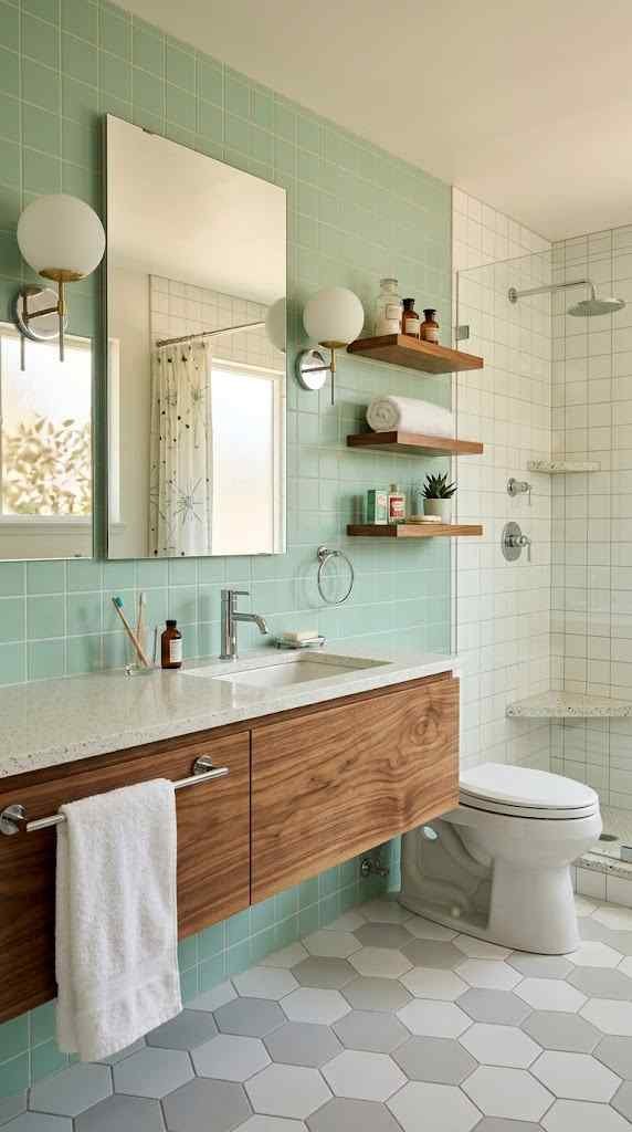
Before you buy a single tile, you need to understand what you’re actually aiming for. Because here’s the problem a lot of people slap a round mirror on the wall, add one fake plant, and call it mid century. That’s not a style. That’s a mood board that gave up halfway.
Real mid century design comes from roughly 1945 to 1969, when post-war optimism, new manufacturing tech, and designers like Eames, Saarinen, and Nelson reshaped American homes. Bathrooms got the same treatment as living rooms: clean lines, warm wood, bold-but-controlled color, and zero unnecessary ornamentation.
Let’s break the DNA down into its actual working parts.
Clean horizontal lines rule everything. Mid century bathrooms stretch wide, not tall. Think long floating vanities, low-profile toilets, horizontal wall tile layouts, and rectangular mirrors that emphasize width. If your eye moves side to side across the room instead of up and down, you’re doing it right. Ornate vertical elements fluted columns, tall arched mirrors, dramatic sconces climbing the wall belong to other eras. Leave them there.
Warm wood is non-negotiable. IMO, this is the single biggest differentiator. Walnut, teak, and oak show up on vanities, shelving, and trim, and they’re the reason mid century bathrooms feel human instead of clinical. Modern minimalist bathrooms often feel like operating rooms with better lighting. Add a walnut vanity and suddenly the same space feels like it wants you there. The wood should have visible grain and a matte or satin finish glossy lacquer kills the effect instantly.
Color shows up with confidence. This era didn’t whisper. Mint green, mustard yellow, burnt orange, powder blue, salmon pink these weren’t accent colors, they were commitments. Entire tile walls. Colored sinks. Even colored toilets (yes, really, and honestly? Some of them were fantastic). You don’t have to go full pink-toilet, but a mid century bathroom with zero color is like a burger with zero seasoning. Technically complete. Emotionally empty.
Geometry does the decorating. Instead of ornamentation, mid century design uses shape as the visual interest. Hexagon floor tiles. Starburst mirrors. Atomic-pattern wallpaper. Boomerang shapes on laminate counters. Round pendant lights hanging like little planets. The pattern comes from repetition and form, not from carving or embellishment.
Materials stay honest. Ceramic tile, real wood, chrome, brass, terrazzo, cork, and glass. What you see is what it is. Faux-marble porcelain that’s pretending to be a Roman bathhouse? Not the vibe. A terrazzo floor with actual chips of color scattered through it? Absolutely the vibe.
Quick reality check does every element need to hit all five markers? No. But your bathroom should score on at least three, or the whole thing reads as “vaguely retro” instead of genuinely mid century. And trust me, guests can tell the difference, even if they can’t explain why.
Nailing the Mid Century Color Palette (Without Living Inside a Crayon Box)
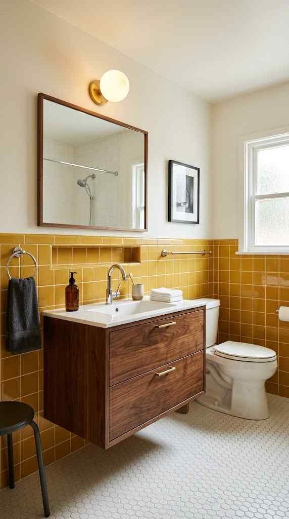
Color is where mid century bathrooms either sing or crash. The era loved bold hues, but here’s what people forget those bathrooms weren’t chaotic. They followed a formula, and once you see it, you can’t unsee it.
The formula: one hero color, one wood tone, one neutral, and metal accents. That’s it. The famous pink bathrooms of the 1950s weren’t pink everything they paired pink tile with white fixtures, chrome hardware, and often a gray or black accent to ground it. Restraint inside boldness. Sounds contradictory, but it’s the whole trick.
Your hero color options, ranked by how forgiving they are:
● Sage or mint green the easiest entry point. Plays beautifully with walnut, reads calm, and photographs like a dream.
● Powder or slate blue slightly moodier, gorgeous with brass, and it hides water spots better than anyone admits.
● Mustard yellow bold but warm. Works best as a partial commitment: one tiled wall, not four.
● Burnt orange or terracotta for the brave. Stunning with teak, risky with cheap lighting.
● Pink or salmon the deep end. Iconic, historically accurate, and your contractor will absolutely question your life choices. Do it anyway if your heart says so.
Where to Put the Color (This Matters More Than the Color Itself)
Here’s an opinion I’ll defend at dinner parties: a mediocre color in the right place beats a perfect color in the wrong one. The classic mid century move is color on the walls or wainscot-height tile, with the floor staying neutral white hex, gray terrazzo, or cork. Flip that (bold floor, plain walls) and you get a more modern remix that still reads authentic.
Ceilings stay white or cream. Always. The one exception? A tiny powder room, where painting the ceiling the same hue as the walls creates a jewel-box effect that makes guests gasp. Small rooms can handle drama that big rooms can’t counterintuitive, but true.
And whatever you choose, buy sample tiles and tape them up for a week. Bathroom lighting lies. That perfect sage at the showroom might turn hospital-gown green under your vanity bulbs. Ask me how I know. :/
The Vanity: The Beating Heart of Every Mid Century Bathroom
If you only have budget for one hero piece, spend it here. The vanity carries more visual weight than everything else in the room combined, and a floating walnut unit can single-handedly drag a 2003 builder bathroom fifty years backward in the best way.
What separates a genuine mid century vanity from a “mid century inspired” imposter on a furniture site? A few mechanical details:
● It floats or sits on tapered legs. Wall-mounted units create that horizontal, airy look the era loved. If it has legs, they angle outward like a sideboard’s never straight, never chunky, never those bun feet that scream “grandma’s dresser.”
Flat-front drawers with recessed or minimal pulls. No raised panels, no shaker frames, no ornate knobs. Edge pulls, finger grooves cut into the wood, or simple round chrome knobs. That’s the vocabulary.
Real wood veneer with visible grain. Walnut is the gold standard, teak the luxury pick, white oak the budget-friendly modern remix. Painted MDF misses the point entirely the grain IS the decoration, remember?
Counter overhang stays minimal. Mid century design tucks everything tight and flush. A counter hanging two inches past the cabinet reads traditional, not modern.
Now, a genuinely great hack: convert a vintage credenza or dresser into a vanity. A 1960s Lane or Broyhill dresser off Facebook Marketplace for $200, plus a vessel sink and a plumber’s afternoon, gives you something no catalog can match. FYI, seal the top with marine-grade polyurethane or the first splash war will destroy your beautiful walnut. Learned that one on behalf of a friend who’s still bitter about it.
For sinks, you’ve got three authentic routes: an integrated rectangular basin (sleekest), a white vessel sink (easiest for conversions), or an undermount with a thin counter edge. Skip the giant farmhouse apron sinks wrong century, wrong house, wrong everything.
Pair the whole thing with a mirror that echoes its width, and half your design work is already done. The other half? Tile and lighting and that’s exactly where we’re headed next.
Tile and Flooring: Where Authenticity Lives (or Dies)
Walk into any bathroom and your brain judges the tile before you’ve consciously registered anything else. It covers the most surface area, sets the geometry, and bonus it’s the hardest thing to change later. So let’s get it right the first time.
The mid century tile hierarchy, floor edition:
● Terrazzo the crown jewel. Those confetti-like chips of marble and glass suspended in concrete were everywhere in the 50s and 60s. Real poured terrazzo costs a fortune, but terrazzo-look porcelain tiles now run $6–12 per square foot and fool almost everyone.
● Small hexagon mosaics white hex with a colored border was the workhorse of the era. Cheap, timeless, and grippy underfoot, which your future self will appreciate at 2 a.m.
● Penny tile round little dots that add texture without shouting. Gorgeous in white with gray grout, or go full vintage with a two-tone pattern.
● Cork the forgotten hero. Warm, quiet, water-resistant when sealed properly, and deeply authentic. Barely anyone uses it anymore, which is exactly why it makes a bathroom memorable
For walls, the era had one dominant move: tile to wainscot height (around 42–48 inches), then paint above. Full floor-to-ceiling tile happened in showers, obviously, but wrapping the whole room top to bottom is a modern habit. Stopping the tile partway costs less AND looks more historically correct. When does a budget decision double as the authentic one? Almost never enjoy it.
Here’s the step-by-step strategy I’d give a friend planning their layout:
Pick the floor first. It anchors everything and has the fewest color options, so let it constrain your palette instead of fighting it later.
Choose your hero wall tile second. This carries your color commitment square 4x4s in your chosen hue, stacked or grid-laid, never brick-pattern subway (that’s a different revival).
Select grout deliberately. Gray grout with white tile reads vintage. White grout with colored tile keeps things crisp. Dark grout with dark tile feels 2019, not 1959.
Order 15% extra. Cuts, breaks, and the one box that arrives shattered. Every single time.
One contrast worth understanding: subway tile versus square tile. Subway leans early-1900s and farmhouse-modern. Square stacked tile is the mid century signature. They’re both “classic white tile” at the store, and they produce completely different rooms. Choose accordingly.
Lighting, Fixtures, and Hardware: The Details That Sell the Whole Story
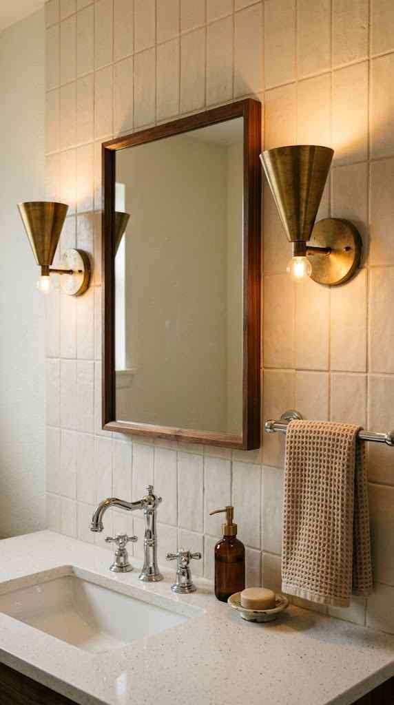
You can nail the vanity, the tile, and the palette then hang one wrong light fixture and watch the entire illusion collapse. Details carry disproportionate weight in this style because there’s no ornamentation to hide behind. Everything visible is a choice.
Lighting comes in three authentic flavors:
● Globe lights. Frosted glass spheres, single or in a row above the mirror. The safest, most iconic pick. A three-globe chrome bar fixture costs under $150 and instantly reads correct.
● Sputnik and atomic fixtures. Those starburst chandeliers with arms shooting in every direction. Spectacular in a bathroom with ceiling height to spare, ridiculous in a low-ceilinged powder room where you’ll bump your head reaching for a towel.
● Cone and bullet sconces. Angled metal shades flanking the mirror, often in brass or matte black. They aim light where you actually need it, which globes beautiful as they are do imperfectly.
Whatever you pick, run warm bulbs at 2700K. Cool white light turns walnut gray and makes sage tile look sickly. The era glowed; your bathroom should too.
On metals: polished chrome is the historically accurate default, brushed brass is the modern remix everyone loves, and matte black is a contemporary addition that works if you keep it consistent. The real rule? Pick one metal and commit across faucet, pulls, towel bars, and lighting. Mixed metals can work in expert hands, but in a small bathroom it usually just looks like you forgot what you bought last month.
For faucets, hunt for low-profile widespread designs with cross handles or slim levers. Skip anything with a gooseneck arc or industrial exposed piping wrong movie entirely.
And hardware? Towel bars in straight chrome rods, toilet paper holders that don’t try to be sculptures, and maybe one starburst hook for personality. The fixtures should support the room, not audition for it.
FAQ’s
Can I create a mid century bathroom without a full renovation?
Yes. Swap the vanity, mirror, lighting, and hardware the transformation is dramatic.
What’s a realistic budget for a mid century bathroom refresh?
Around $2,000–5,000 for cosmetic updates; full renovations typically run $15,000 and up.
Does a mid century bathroom hurt resale value?
No buyers consistently love the style. Just avoid overly personal color extremes.
Are walk-in showers historically accurate for this style?
Not strictly, but frameless glass blends beautifully with authentic mid century bathroom elements.
Which plants suit a mid century bathroom best?
Snake plants, pothos, and rubber plants they love humidity and look era-appropriate.
CONCLUSION
Sixty years from now, somebody will renovate the “modern farmhouse” bathrooms of 2020 and quietly apologize to the walls. Nobody will ever do that to a proper mid century bathroom. That’s the entire pitch.
You now have the full playbook: one hero color grounded by wood and neutrals, a floating walnut vanity doing the heavy lifting, square tile stopped at wainscot height, terrazzo or hex underfoot, globe lights glowing warm, and one metal finish carried through every last towel bar. None of it requires a designer. Most of it doesn’t even require a big budget a Marketplace credenza and a weekend of courage get you shockingly far.
The only real mistake is timidity. Half-committed retro reads as accidental. Full commitment reads as taste. So pick the sage green. Buy the starburst mirror. Let your contractor raise an eyebrow at the pink tile he raised one at shiplap too, and look how confident everyone was about that.
Your bathroom is the first room you see every morning. Make it one that a 1958 architect would nod at. Future you, coffee in hand under that warm globe light, will be very glad you did.